The art of accessorising lies in achieving perfect balance – creating visual interest without crossing into overwhelming territory. Many fashion enthusiasts struggle with this delicate equilibrium, either playing it too safe with minimal accessories or going overboard with statement pieces that compete for attention. The key to sophisticated styling lies in understanding proportion, colour theory, and strategic placement of accessories to enhance rather than overshadow your overall look.
Modern fashion culture celebrates individual expression, yet the most stylish individuals understand that restraint often creates more impact than abundance. Professional stylists employ specific methodologies to coordinate accessories seamlessly, creating looks that appear effortlessly curated while following precise principles of design harmony. Whether you’re building a capsule wardrobe or refining your existing collection, mastering these coordination techniques will elevate your style quotient significantly.
Capsule wardrobe integration strategies for balanced accessory selection
A well-constructed capsule wardrobe serves as the foundation for effective accessory coordination, providing a cohesive base that allows accessories to enhance rather than clash with your clothing choices. The capsule approach emphasises versatility and intentional selection, ensuring that each accessory piece can work harmoniously with multiple outfit combinations while maintaining your personal style aesthetic.
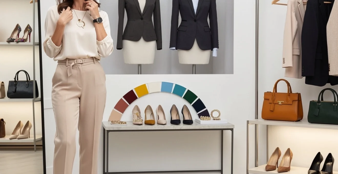
Core neutral accessory foundation building techniques
Building a neutral accessory foundation requires strategic investment in timeless pieces that transcend seasonal trends and provide maximum versatility. Professional stylists recommend allocating approximately 70% of your accessory budget to neutral staples – classic leather handbags in black, tan, or navy; quality watches in gold or silver metals; and structured belts that can cinch various silhouettes. These foundational pieces should complement your skin tone and personal colour palette whilst offering the flexibility to anchor more adventurous styling choices.
The golden ratio of neutrals suggests maintaining a balanced collection where warm and cool tones complement each other. For instance, if your wardrobe leans towards cool-toned neutrals like navy and grey, incorporating warm metallic accessories in gold or brass creates visual interest without disrupting harmony. This approach ensures that your neutral accessories enhance your natural colouring rather than competing with it.
Statement piece rotation systems for maximum versatility
Implementing a systematic approach to statement piece rotation prevents accessory fatigue whilst maximising the impact of your investment pieces. Professional wardrobe consultants recommend the “one statement rule” – allowing a single bold accessory to take centre stage whilst supporting pieces remain understated. This might involve featuring dramatic earrings with simple necklaces and classic handbags, or highlighting an architectural handbag whilst keeping jewellery minimal.
Creating a statement piece calendar helps ensure balanced rotation throughout your wardrobe. Consider designating specific days for different statement categories: Monday for bold necklaces, Wednesday for striking handbags, Friday for dramatic earrings. This systematic approach prevents decision fatigue whilst ensuring all your special pieces receive appropriate attention and wear.
Colour wheel theory application in accessory coordination
Understanding colour wheel relationships enables sophisticated accessory coordination that appears intuitive yet follows scientific principles of visual harmony. Complementary colours – those positioned opposite each other on the colour wheel – create dynamic contrast when applied thoughtfully to accessory selection. For instance, a burgundy handbag paired with a forest green outfit creates rich, autumnal sophistication without overwhelming the eye.
Professional stylists utilise the 60-30-10 rule for colour distribution: 60% neutral base, 30% secondary colour, and 10% accent colour applied through accessories.
Analogous colour schemes – using colours adjacent on the wheel – offer a more subtle approach to accessory coordination. Combining blue-toned accessories with purple or green garments creates gentle transitions that feel naturally harmonious. This technique works particularly well in professional environments where understated elegance is valued over bold contrast.
Texture mixing principles for sophisticated layering
Mastering texture combinations adds depth and visual interest to accessory coordination without relying solely on colour contrast. The key lies in balancing smooth and textured surfaces, matte and glossy finishes, and structured versus flowing elements. Pairing a sleek leather handbag with chunky knit scarves or
Pairing a sleek leather handbag with chunky knit scarves or textured wool coats, for example, creates a refined interplay of structure and softness that feels intentional rather than busy. To avoid overwhelming your look, aim to feature one dominant texture supported by one or two subtler ones, rather than layering multiple competing finishes. High-shine metals, patent leather and sequins should generally be balanced with matte fabrics like cotton, cashmere or suede so the eye has somewhere to rest. Think of texture the way a chef thinks of seasoning: a pinch of contrast brings a dish to life, but too much can overpower the whole experience.
Professional styling methodologies for proportion management
Proportion management is at the heart of coordinating accessories without overwhelming your look. Even the most beautiful jewellery, handbags and shoes can feel “too much” when their scale and placement are out of sync with your silhouette. Professional stylists use visual design principles – including the golden ratio, scale contrast and visual weight distribution – to ensure accessories enhance your natural proportions and the lines of your outfit.
Golden ratio implementation in jewellery placement
The golden ratio (approximately 1:1.6) is a classic design principle that can be applied to jewellery placement for a more harmonious look. In practical terms, this means positioning key jewellery pieces along the upper third and lower third of your torso rather than crowding everything around the centre of your body. A necklace that ends roughly one-third of the way between your chin and your waist, for instance, tends to be more flattering than one that cuts awkwardly at mid-bust.
When layering necklaces, you can use the golden ratio to create pleasing spacing: if your shortest chain sits at 40cm, aim for the next at around 60–65cm, rather than just a few centimetres longer. The same principle applies to bracelet stacks – one statement bangle paired with two slimmer pieces often looks more refined than four identical chunky cuffs. By echoing this naturally appealing proportion around your face and décolletage, you guide the eye gracefully rather than creating a cluttered focal point.
Scale balancing techniques for handbags and footwear
Handbags and footwear carry significant visual weight, so their scale needs to be balanced carefully to avoid overwhelming your frame. Petite individuals generally look more proportionate with smaller to medium-sized bags and sleeker shoe shapes, while taller figures can support oversized totes, wide straps and chunkier soles. That doesn’t mean you must avoid a large bag if you’re shorter, but pairing it with streamlined shoes and minimal jewellery helps keep the overall look in check.
A useful rule is to contrast bag and shoe scale rather than doubling up. If you opt for bold platform boots or heavy loafers, a more compact crossbody or structured mini bag will keep the outfit from feeling bottom-heavy. Conversely, if your bag is the star – think slouchy oversized hobo or sculptural designer tote – choose simpler, lower-profile shoes so the two don’t compete. This “one bold, one quiet” approach between handbag and footwear creates balance while still allowing you to showcase standout pieces.
Visual weight distribution across body zones
Visual weight refers to how much attention an accessory draws relative to other elements in your outfit. To avoid overwhelming your look, you want that weight distributed thoughtfully across three main zones: upper (head, earrings, necklaces), middle (belts, watches, bracelets) and lower (bags, shoes). Loading all the drama into one zone – for example, large earrings, a thick choker and bold sunglasses – can make the top half of your body feel crowded and unbalanced.
Instead, imagine your outfit as a vertical line and place “weight” at different points along it. If you choose statement earrings, consider subtler neck jewellery and allow a striking belt buckle or sculptural shoes to carry some of the visual interest further down. This is similar to composing a photograph: your eye should travel smoothly from top to toe, pausing at deliberate points rather than getting stuck in one area. When in doubt, remove one accessory from the busiest zone and add a quieter detail (like a fine bracelet or sleek watch) somewhere else.
Silhouette enhancement through strategic accessory positioning
Accessories can dramatically refine your silhouette when placed with intention. Belts are perhaps the most powerful tool here: worn at the true waist, they can create or emphasise an hourglass shape; positioned on the hips, they can lengthen the torso; worn loosely over a blazer, they can add structure to a relaxed outfit. The aim is to align belt placement with the part of your body you’d like to highlight, rather than defaulting to trouser belt loops.
Necklines and jewellery placement are equally important. Long pendant necklaces draw the eye vertically and can visually lengthen the torso – ideal for balancing fuller hips or shorter waists. Chokers and short collars, on the other hand, bring focus upward and can be flattering with elongated necks or more minimal outfits. Even bag placement matters: wearing a crossbody with the bag resting just above the hip bone creates a diagonal line that can subtly define the waist, while very low-slung bags can drag the eye downward and shorten the leg line. Small adjustments in where accessories sit often make the difference between “thrown together” and thoughtfully styled.
Luxury brand coordination principles and high-street alternatives
Coordinating luxury accessories without looking overdone requires a considered approach, especially when logos and distinctive branding are involved. The most polished looks treat luxury pieces as accents rather than a head-to-toe billboard. One visible logo – a belt, a bag or a pair of shoes – is usually enough to convey refinement; stacking several branded items in one outfit can feel heavy-handed and visually noisy.
A professional strategy is to anchor your look with one investment accessory and surround it with well-chosen high-street alternatives. For example, a heritage leather tote pairs beautifully with minimalist jewellery and sleek high-street loafers in similar tones. Matching the quality of materials and colour family – smooth black leather with black faux leather, warm tan with cognac – helps your more affordable pieces sit comfortably alongside your luxury items. This also allows you to experiment with trends (such as oversized chains or bright resin earrings) without diluting the timeless appeal of your investment pieces.
When mixing price points, treat everything by the same styling rules: polish your high-street shoes, store costume jewellery carefully and tailor inexpensive belts if needed. Care and fit often matter more for overall impact than the label itself. The result is a coordinated accessory wardrobe where luxury and accessible pieces work in unison, rather than competing for attention.
Seasonal accessory adaptation without style saturation
Seasonal shifts are prime opportunities to refresh your accessories, but constant rotation can quickly lead to cluttered styling if you add without editing. A deliberate seasonal capsule – a small set of accessories you prioritise for three months – helps you stay coordinated without falling into trend overload. Before each season, review your existing pieces and select key items that support the colours and fabrics you’ll wear most often.
In colder months, visual weight naturally increases with coats, boots and heavier fabrics, so it makes sense to scale up your accessories slightly: chunkier scarves, more substantial boots and structured bags that hold their shape under layers. To prevent style saturation, keep the palette relatively tight – perhaps two main neutrals and one accent tone repeated across your winter accessories. In spring and summer, lighten both colour and texture: woven bags, fine layered jewellery and lighter-toned shoes create airiness without needing dozens of extra items. Rather than buying entirely new sets each season, consider swapping out just one or two elements – a scarf, a belt or a bag strap – to re-energise your look in a controlled, coordinated way.
Professional wardrobe accessory guidelines for corporate environments
Corporate environments add an extra layer of complexity to coordinating accessories, as you need to balance self-expression with professionalism and, in some sectors, strict dress codes. The goal is to look polished and credible while still feeling like yourself. Accessories in the workplace should support your message rather than distract from it, which means paying close attention to scale, colour and sound (noisy bangles or clinking charms can be more disruptive than you think).
Conservative banking sector accessory protocols
In conservative banking and finance roles, subtlety is paramount. Accessories should signal reliability and discretion, not trendiness. Opt for classic pieces in high-quality materials: a simple leather belt, a refined watch, stud earrings and perhaps a delicate chain or small pendant. Colours are best kept within a restrained palette of black, navy, charcoal, white, and muted metals like polished steel or soft gold.
Logo-heavy items and overly decorative pieces can appear out of place in this context, as can very bright nail polish or loudly patterned scarves. If you wish to introduce personality, do so in small doses – a textured tie, a fine silk pocket square or a scarf in a subdued print that coordinates with your suit. The aim is to look “finished” rather than “fashion-forward”, with accessories that would still feel appropriate in a board presentation or client meeting.
Creative industry accessory expression boundaries
Creative industries such as design, marketing and media generally offer far more freedom for expressive accessories, but even here, coordination matters. You can embrace bolder jewellery, interesting eyewear and distinctive footwear, provided the overall look remains intentional rather than chaotic. A strong signature piece – such as sculptural earrings or a distinctive watch – can become part of your personal brand, especially when styled consistently.
To avoid overwhelming your look in creative settings, treat bold accessories as part of a cohesive colour story rather than random additions. For example, neon trainers feel more considered when they echo a stripe in your shirt or a tone in your bag. Similarly, mixing metals and materials works best when you repeat at least one element (such as matte black or brushed gold) throughout your accessories. You can push boundaries, but a sense of internal logic in your choices will keep your outfits professional and memorable for the right reasons.
Legal profession appropriate accessory standards
Legal environments, particularly court-facing roles, demand a refined, low-distraction approach similar to traditional corporate finance, with an added emphasis on gravitas. Jewellery should be minimal and quiet: small hoops or studs, slim bracelets that don’t jangle and unobtrusive rings. Watches are excellent here – they signal punctuality and professionalism without drawing undue focus.
Bags in legal settings should be structured enough to hold documents and technology, with clean lines and limited hardware. Classic colours – black, dark brown, navy or deep burgundy – coordinate easily with suiting and robes. If you introduce colour, keep it to one carefully chosen element, such as a silk scarf or subtle tie, and ensure it doesn’t distract in formal proceedings. The objective is to project authority and trustworthiness, with accessories that support your credibility rather than your trend awareness.
Healthcare workplace compliance and style integration
Healthcare roles often come with strict guidelines around hygiene and safety, which can limit traditional accessory choices. Yet within these boundaries, it is still possible to coordinate accessories thoughtfully and express personal style. Many clinical environments prohibit rings with stones, dangling earrings or bracelets that could harbour bacteria or catch on equipment, so focus instead on permitted items such as discreet stud earrings, simple wedding bands, and practical, easy-clean watches with silicone or metal straps.
Non-clinical healthcare roles and administrative positions may allow more flexibility, but the same principles of function and restraint apply. Consider using colour in compression socks, lanyards or badge reels that coordinate with your scrubs or uniform without becoming visually overwhelming. Hair accessories are another area where you can introduce subtle style – think neat headbands, secure clips or simple scrunchies in harmonious tones. By prioritising compliance and comfort first, then layering in small, coordinated touches, you can maintain a professional, approachable appearance without compromising safety or cleanliness.