# Creating Effortless Outfits with Neutral Colour Palettes
The modern wardrobe revolution has quietly shifted towards simplicity, quality, and timeless elegance. Neutral colour palettes have emerged as the foundation of sustainable, versatile fashion—offering endless styling possibilities whilst reducing decision fatigue and unnecessary purchases. From the soft warmth of beige and camel to the cool sophistication of dove grey and ivory, these understated shades form the backbone of every well-curated capsule wardrobe. The beauty of neutral tones lies not in their restraint, but in their remarkable ability to adapt to any occasion, season, or personal style whilst maintaining an air of refined confidence. Whether you’re building your first minimalist wardrobe or refining an existing collection, mastering the art of neutral dressing transforms how you approach daily styling, travel packing, and long-term wardrobe investment.
Understanding the core neutral colour theory: beige, taupe, ivory and greige foundations
Neutral colours operate on a fundamentally different principle than their vibrant counterparts. Rather than commanding attention through saturation and brightness, neutrals create visual harmony through subtle variations in tone, undertone, and depth. The traditional neutral family extends beyond simple black and white to encompass an entire spectrum of earth-derived shades: beige, taupe, ivory, greige, sand, mushroom, oatmeal, ecru, champagne, and stone. Each of these tones carries distinct characteristics that influence how they interact with skin tones, other colours, and different lighting conditions throughout the day.
Understanding the temperature of neutral shades proves essential for creating cohesive outfits. Warm neutrals—including camel, cognac, wheat, honey beige, and terracotta—contain underlying yellow, orange, or red pigments that evoke earthiness and approachability. These shades typically complement individuals with warm undertones in their complexion, creating a harmonious, sun-kissed appearance. Cool neutrals such as dove grey, platinum, icy white, slate, and charcoal contain blue, purple, or pink undertones that project sophistication and crispness. Those with cool skin undertones find these shades particularly flattering, as they enhance natural colouring without creating unwanted contrast or washing out the complexion.
The recent emergence of greige—a sophisticated hybrid of grey and beige—exemplifies how neutral colour theory continues to evolve. This versatile shade bridges the gap between warm and cool palettes, making it exceptionally useful for creating transitional outfits that work across multiple seasons. Similarly, taupe operates as a chameleon neutral, shifting between brown and grey depending on surrounding colours and natural light. Mastering these nuanced shades allows you to build outfits with remarkable depth whilst maintaining the simplicity that defines neutral dressing.
The most sophisticated wardrobes aren’t built on trend-chasing or colour experimentation—they’re founded on understanding how neutral tones interact, layer, and complement individual colouring to create effortless, repeatable style formulas.
Building your capsule wardrobe with monochromatic neutral layering techniques
Constructing a functional capsule wardrobe begins with strategic selection of foundational pieces that work harmoniously across multiple outfit combinations. The principle of monochromatic layering—using various shades within the same colour family—creates visual continuity whilst adding dimensional interest. This approach proves particularly effective with neutral palettes, where subtle tonal shifts provide sophistication without overwhelming the eye. A well-designed neutral capsule typically contains between fifteen and twenty carefully chosen pieces that generate dozens of distinct outfit possibilities through thoughtful mixing and matching.
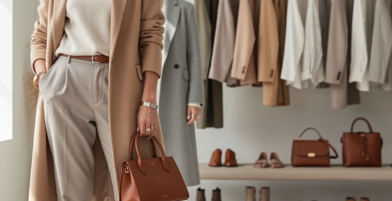
Selecting quality base pieces in camel, cream and stone tones
The foundation of any neutral wardrobe rests on investment-worthy base pieces that withstand both physical wear and stylistic trends. Quality trumps quantity in every scenario—a single, impeccably tailored camel coat delivers more value than three mediocre alternatives. When selecting base pieces, prioritise classic silhouettes in premium natural fibres: a cream silk blouse, stone-coloured wide-leg trousers, a structured beige blazer, and a versat
atile knit in a soft oatmeal tone. These core garments function as your daily uniforms, so look for precise tailoring through the shoulders, clean hemlines, and neutral colours that sit comfortably between warm and cool. When you compare pieces in camel, cream, and stone side by side, choose the versions that neither clash with your skin nor feel too close to it in value—this prevents that “washed out” effect that many people associate with neutral colour palettes.
To maintain coherence in your neutral capsule wardrobe, keep silhouettes streamlined and avoid excessive trend details. A camel wrap coat, for example, will outlive an exaggerated puff-sleeve jacket in both versatility and longevity. Consider your lifestyle: do you need more smart casual pieces for the office, or relaxed separates for working from home and weekends? Start by building a small grid of scenarios—work, errands, social, travel—and ensure your camel, cream, and stone-toned basics can flex across at least three of these categories. That flexibility is what makes neutral outfits feel truly effortless day after day.
Mastering texture variation through linen, cashmere and wool blends
Once your base pieces are in place, texture becomes the key tool for making monochromatic neutral outfits look intentional rather than flat. Think of texture the way a designer thinks of typography: subtle shifts change the whole mood. Lightweight linen in natural, stone, or greige tones introduces breathability and ease, perfect for warmer months or layered under heavier pieces. In contrast, cashmere and fine merino wool in oatmeal, mushroom, or ivory bring softness and quiet luxury that reads instantly refined, even in the most understated silhouettes.
Blending linen, cashmere, and wool within a single outfit creates depth without needing bold colour. A sand-coloured linen shirt under a camel wool blazer, paired with cream denim, delivers three distinct textures within one neutral palette, which keeps the look visually interesting. You might ask: how many textures are too many in a neutral look? As a general guideline, aim for two to three complementary fabric stories—such as smooth (silk or cotton poplin), soft (cashmere or brushed wool), and structured (denim or twill). This balance allows your neutral colour palette to shine whilst ensuring the outfit still feels cohesive.
Implementing the 70-30 rule for tonal dressing harmony
To prevent neutral outfits from feeling chaotic or overly busy, it helps to adopt a simple composition principle: the 70-30 rule. In tonal dressing, this means allowing approximately 70% of your outfit to sit within one dominant neutral family—such as warm camel and beige—while reserving the remaining 30% for either a different depth within that family or a bridging neutral like greige or stone. This ratio creates a clear visual anchor, making your ensemble feel harmonious even when multiple textures and layers are in play.
For example, you might wear a camel coat, wheat knit, and beige trousers as your 70%, then introduce stone suede boots and an ivory scarf as the 30% accent. The outfit remains firmly rooted in warm neutrals, but the subtle shift in value and undertone stops it from looking flat. You can also invert this rule for more contrast-driven days: let charcoal or deep taupe dominate 70% of the look, with the remaining 30% in lighter oatmeal or ecru to brighten your face. With practice, you begin to “feel” this balance intuitively, much like learning the rhythm of a favourite song.
Strategic investment in sand, mushroom and oatmeal transitional staples
Certain neutral shades act as powerful bridge colours across both seasons and undertones—sand, mushroom, and oatmeal are prime examples. Sand sits between beige and stone, making it ideal for pairing with both warm camel and cool grey. Mushroom has a soft brown-grey quality that complements almost every other neutral, functioning much like a visual adaptor in your wardrobe. Oatmeal, with its flecks of warm and cool fibres, is particularly flattering in knitwear, as it adds subtle movement and disguises minor signs of wear over time.
Strategic investment in these transitional staples means prioritising pieces you know you will wear across at least three seasons. A sand trench coat, mushroom tailored trousers, and an oatmeal crew-neck jumper can be rotated with linen in summer and layered with merino and cashmere in winter. Ask yourself before purchasing: Can this item link at least five other pieces I already own? If the answer is yes, that sand, mushroom, or oatmeal piece is likely to pull more weight in your closet than a trend colour that only matches one outfit. Over a year, these quiet connectors are often what make your neutral colour palette feel truly cohesive and low-effort.
Advanced styling methods for warm versus cool neutral undertones
Identifying your skin’s undertone: champagne, ecru or oyster white alignment
Understanding your skin’s undertone is the backbone of choosing neutral clothing colours that flatter rather than drain you. Whilst online quizzes can be helpful, the most reliable method is still observation. Look at the inside of your wrist in natural daylight: do your veins appear more green (often indicating warm undertones) or blue and purple (often indicating cool undertones)? If they seem somewhere in between, you may lean neutral, which gives you more flexibility in mixing champagne, ecru, and oyster white tones in your wardrobe.
Warm undertones tend to glow in champagne, cream, and soft honey beige—these shades mirror the gentle warmth of your skin, much like golden hour lighting. Cool undertones usually look fresher in oyster white, dove grey, and soft stone, which echo the subtle pink or blue notes in the complexion. Ecru and light greige often sit comfortably in the middle, working for both sides when the depth is chosen carefully. If you are unsure where you sit, drape a champagne top and a crisp oyster white shirt near your face in front of a mirror; the one that makes your eyes brighter and your skin more even is your better alignment.
Combining warm cognac and wheat shades with cool dove grey and platinum
Once you understand your own undertones, you can begin to blend warm and cool neutrals with intention. Think of this process like interior design: wood tones (cognac, wheat, camel) can look striking against cooler stone and metal finishes (dove grey, platinum, charcoal) when balanced carefully. The key is to let one temperature dominate whilst the other supports. For instance, you might create a warm-leaning outfit with wheat trousers, a camel knit, and a cognac belt, then introduce cool platinum jewellery and a dove grey coat as refined contrast.
If your undertone is warm, keep the garments closest to your face within the warm family—perhaps a cream turtleneck—while letting cooler tones appear in tailored pieces further away, such as dove grey trousers or a slate bag. For cool undertones, reverse the formula: a soft ash sweater or platinum silk shirt near the face, grounded with cognac loafers or a tan tote. This way, you enjoy the dimension of mixed neutrals without sacrificing the flattering effect of your primary colour temperature.
Achieving visual interest through tonal gradation in monochrome outfits
Tonal gradation involves stepping gradually from light to dark within a single colour family, creating a sense of flow that feels intentional and polished. Imagine a column of ivory, oatmeal, mushroom, and chocolate—each shade is a deeper note in the same chord, producing harmony rather than contrast. When you arrange your neutral outfits with this in mind, you avoid the “blocky” look that sometimes occurs with monochrome dressing. Starting with the lightest shade nearest the face typically softens features and reflects light, which is especially useful in cooler seasons.
To build a gradient, choose three related tones: for example, cream, sand, and camel. Place the lightest on top (a cream knit), the mid-tone in the middle (sand trousers or skirt), and the darkest at the base (camel boots or coat). Alternatively, you can anchor the darkest shade at the top—such as a chocolate blazer—with mid-toned trousers and lighter shoes for a more grounded look. Think of tonal gradation as the fashion equivalent of a well-blended eyeshadow: each shade is distinct up close, but from a distance, the whole effect is seamless and sophisticated.
Accessorising neutral ensembles with metallics, leather and minimal jewellery
Incorporating gold, rose gold and brushed silver hardware accents
Accessories have a disproportionate impact in neutral outfits because every detail becomes more visible against a pared-back canvas. Metallic hardware—on belts, bags, shoes, and jewellery—acts as the “punctuation” in your look. Gold tends to pair beautifully with warm neutrals like camel, cognac, and wheat, enhancing their richness and echoing sunlit tones. Brushed silver and platinum finishes complement cool neutrals such as dove grey, charcoal, and icy white, reinforcing their crisp, modern edge.
If your undertone is neutral or you enjoy mixing metals, rose gold offers an elegant middle path. Its subtle warmth works with both champagne and stone, while still looking polished alongside greige and mushroom. Rather than scattering lots of different metal tones throughout one outfit, select one dominant finish and repeat it two to three times—perhaps brushed gold hoop earrings, a gold-buckled belt, and a bag with gold hardware. This repetition creates visual rhythm, much like a motif in architecture, which is especially important when styling minimalist neutral looks.
Selecting cognac leather goods and suede accessories for depth
Leather and suede accessories in cognac, espresso, and tan are some of the most effective tools for adding depth to a neutral wardrobe. Cognac, in particular, reads as both classic and contemporary, pairing seamlessly with beige, camel, grey, navy, and even black. A cognac crossbody bag or belt can instantly warm up a cool-toned outfit, preventing grey and ivory combinations from feeling too stark. Suede, with its matte texture, introduces a soft-focus effect that contrasts beautifully with smoother fabrics like silk, cotton poplin, and fine wool.
When curating your neutral accessories, think in terms of a small capsule: one structured leather tote, one crossbody, one belt, and one pair of everyday shoes in a unified colour story. Suede ankle boots in mushroom, loafers in cognac, and a slim tan belt can support dozens of outfits across the year. Ask yourself: If I removed all bright-coloured accessories from my wardrobe, would my neutral bags and shoes still make my outfits feel finished? If the answer is no, focusing your next investment on a high-quality leather or suede piece in a versatile shade will offer far more styling mileage than another trend item.
Applying the capsule accessory matrix for versatile outfit multiplication
A practical way to ensure your neutral accessories pull their weight is to use a simple capsule accessory matrix. Visualise three rows—bags, shoes, jewellery—and three columns—everyday, smart casual, and formal. Aim to fill each cell with one neutral option that can pair with at least 70% of your clothing. For instance, your everyday bag might be a mushroom crossbody, your smart casual choice a cognac structured tote, and your formal piece an ivory clutch with minimal gold hardware.
The same method applies to shoes: white or stone trainers for everyday, tan loafers or ankle boots for smart casual, and nude or black heels for formal occasions. In the jewellery row, consider slim gold or silver hoops for everyday, a statement cuff or layered necklace for smart casual, and a refined bracelet or drop earring for formal events. By building this matrix within a cohesive neutral colour palette, you effectively multiply your outfit combinations without adding bulk to your wardrobe. This approach reflects what many stylists already do intuitively: create a small ecosystem of accessories that work together seamlessly.
Seasonal adaptations: transitioning neutral palettes from linen to merino wool
One of the biggest advantages of a neutral wardrobe is how smoothly it transitions between seasons with only a few considered swaps. In spring and summer, lighter fabrics like linen, cotton, and silk in shades of ecru, sand, and oyster white offer breathability while maintaining polish. As temperatures drop, you simply translate those same neutral colour palettes into heavier fabrics—merino wool, cashmere, brushed cotton, and tweed—without needing to rethink your entire style identity. This continuity not only saves time and money but also reinforces your personal aesthetic year-round.
A useful strategy is to identify your “colour constants”—perhaps camel outerwear, stone trousers, and ivory knits—and then adjust supporting pieces seasonally. In warmer months, a sand linen blazer might replace a camel wool coat; in cooler months, that linen blazer gives way to a structured mushroom wool version. The colour story stays consistent, but the textures respond to the climate. Data from fashion resale platforms consistently shows that high-quality neutral outerwear and knitwear hold their value better over time, underlining the benefit of investing in merino, cashmere, and wool blend pieces in classic tones.
Layering is what allows your neutral outfits to move between 18°C and 2°C with minimal effort. A greige slip dress worn alone with sandals in summer can be reimagined with a merino turtleneck underneath, an oatmeal cardigan on top, and knee-high boots in winter. When planning seasonal shopping, think less about introducing new colours and more about filling fabric gaps—such as adding a mid-weight camel cardigan for autumn or a breathable stone linen trouser for high summer. This way, your neutral colour palette remains coherent, and your wardrobe feels like a single, evolving story rather than four disconnected seasons.
Avoiding common pitfalls in neutral dressing: flatness, washing out and monochrome fatigue
Despite their many advantages, neutral outfits come with a few common challenges: they can sometimes appear flat, wash out the complexion, or feel repetitive over time. Flatness typically occurs when an outfit relies on a single fabric type and value—for instance, pairing a beige cotton tee with similar-toned chinos and trainers. The solution is to reintroduce contrast through texture or depth: swap the tee for a ribbed knit, add a darker belt in cognac, or choose shoes in a deeper camel or stone. Even a small change in fabric, such as moving from smooth leather to suede, can make a neutral look feel more considered.
Washing out is another frequent concern, especially with lighter tones like ivory, ecru, and pale beige. If you notice that these shades make you look tired or dull, the issue is usually one of undertone or value rather than the colour family itself. Try shifting one step warmer or cooler—moving from cool oyster white to warmer cream, or from yellow-based beige to more balanced greige. You can also keep the lightest tones away from your face, wearing them on the lower half of your outfit while choosing a slightly deeper, more flattering shade near your complexion.
Monochrome fatigue tends to set in when you repeat very similar neutral outfits without variation in silhouette, proportion, or accessories. To counter this, think in terms of “style levers” you can adjust: tuck versus untucked, cropped versus longline, fitted versus oversized. For example, switch from a chunky cardigan-and-jeans formula to a sleek turtleneck under a structured blazer with tailored trousers—all in the same camel and stone palette, but with a very different energy. Rotating metallic finishes, experimenting with belts, and occasionally introducing a subtle pattern—such as a pinstripe, herringbone, or fine check—also keeps your neutral wardrobe feeling fresh without compromising its effortless character.
When you view these pitfalls as signals rather than failures, they become prompts to refine your approach. If an outfit feels flat, add texture; if it washes you out, adjust undertone or depth; if it bores you, experiment with proportion or accessories. Over time, you will build a personalised set of neutral colour formulas that you can rely on in any season or setting, making effortless dressing not just an aesthetic choice, but a practical, sustainable lifestyle shift.