Fashion may evolve at breakneck speed, but certain outfit combinations transcend the whims of seasonal trends and maintain their relevance year after year. These enduring formulas rely on fundamental principles of design, colour theory, and proportion to create looks that feel both contemporary and classic. Understanding which combinations consistently deliver polished results can transform your wardrobe strategy from reactive trend-following to confident, intentional styling.
The secret to timeless dressing lies in recognizing the interplay between foundational pieces, complementary colours, and proportional balance. Whether you’re building a capsule wardrobe or seeking reliable formulas for daily dressing, these proven combinations offer versatility, sophistication, and longevity. From heritage patterns that have endured for centuries to modern interpretations of classic silhouettes, mastering these outfit equations provides a solid foundation for effortless elegance.
Classic monochromatic schemes: navy, black, and neutral foundation pieces
Monochromatic dressing represents the pinnacle of sophisticated simplicity, where varying tones, textures, and proportions within a single colour family create visual depth without complexity. This approach eliminates the guesswork associated with colour coordination whilst maintaining an inherently polished appearance. The key lies in understanding how different shades and textures within the same colour family interact to create dimension and interest.
The most elegant outfits often feature subtle variations within a single colour palette, proving that sophistication doesn’t require complexity.
Navy blazer and white shirt combinations with tailored trousers
The navy blazer serves as fashion’s most reliable anchor piece, offering unparalleled versatility across formal and casual contexts. When paired with crisp white shirting, this combination creates a foundation that works equally well for business meetings, weekend lunches, or evening events. The contrast between navy’s depth and white’s brightness provides visual interest whilst maintaining sophistication.
Tailored trousers complete this triumvirate by introducing structure and proportion. Grey flannel, cream chinos, or matching navy pieces all work harmoniously within this framework. The key consideration lies in ensuring proper fit across all three pieces – the blazer should skim the shoulders naturally, the shirt should provide clean lines without excess fabric, and trousers should maintain their shape whilst allowing comfortable movement.
All-black ensembles: texture mixing and fabric weight considerations
All-black dressing requires careful attention to texture variation to avoid appearing flat or monotonous. Combining different fabric weights and finishes – perhaps wool crepe with silk charmeuse, or cotton jersey with leather – creates visual intrigue through subtle light reflection and surface variation. This technique prevents the uniform effect that can occur when wearing identical black fabrics.
Fabric weight plays a crucial role in achieving balanced proportions within monochromatic black outfits. Heavier materials naturally create structure and definition, whilst lighter fabrics provide movement and fluidity. Strategic placement of these different weights – perhaps a structured blazer over a flowing silk blouse – ensures the outfit maintains both shape and elegance. Consider incorporating matte and glossy finishes to add another layer of textural interest.
Camel and beige tonal layering for sophisticated neutrals
Camel and beige represent fashion’s most versatile neutral family, offering warmth and sophistication without the starkness of pure black and white combinations. These tones complement virtually every skin tone whilst providing endless layering opportunities. The spectrum from pale cream to rich camel allows for subtle gradations that create depth and visual movement.
Successful tonal layering in this palette requires understanding undertones – warm beiges with honey or golden notes pair beautifully with rich camels, whilst cooler beiges with grey undertones complement taupe and mushroom shades. Incorporating different textures such as cashmere, wool, and linen prevents the overall look from appearing washed out whilst maintaining the serene elegance that makes this combination so enduring.
Grey scale gradations: charcoal to dove grey coordination
Grey’s remarkable versatility stems from its position as
Grey’s remarkable versatility stems from its position as a true neutral, sitting comfortably between warm and cool spectrums. This makes it an ideal base for timeless outfits that feel refined without appearing severe. Working from deep charcoal through mid-grey to soft dove tones allows you to build depth in a way that mimics black-and-white dressing but with far more subtlety. A charcoal blazer, mid-grey knit, and pale grey trousers, for instance, create a sophisticated gradient that works from office to evening.
To keep grey scale outfits from looking flat, pay attention to both undertone and placement. Cooler blue-based greys pair especially well with silver jewellery and crisp white shirts, while warmer greys with brown or taupe notes harmonise with camel coats and tan accessories. As a rule of thumb, place the darkest greys where you want structure (blazers, tailored trousers, outerwear) and reserve the lightest tones for pieces that add softness, such as knitwear, T-shirts, or scarves. This contrast in both value and fabric gives monochromatic grey outfits their enduring appeal.
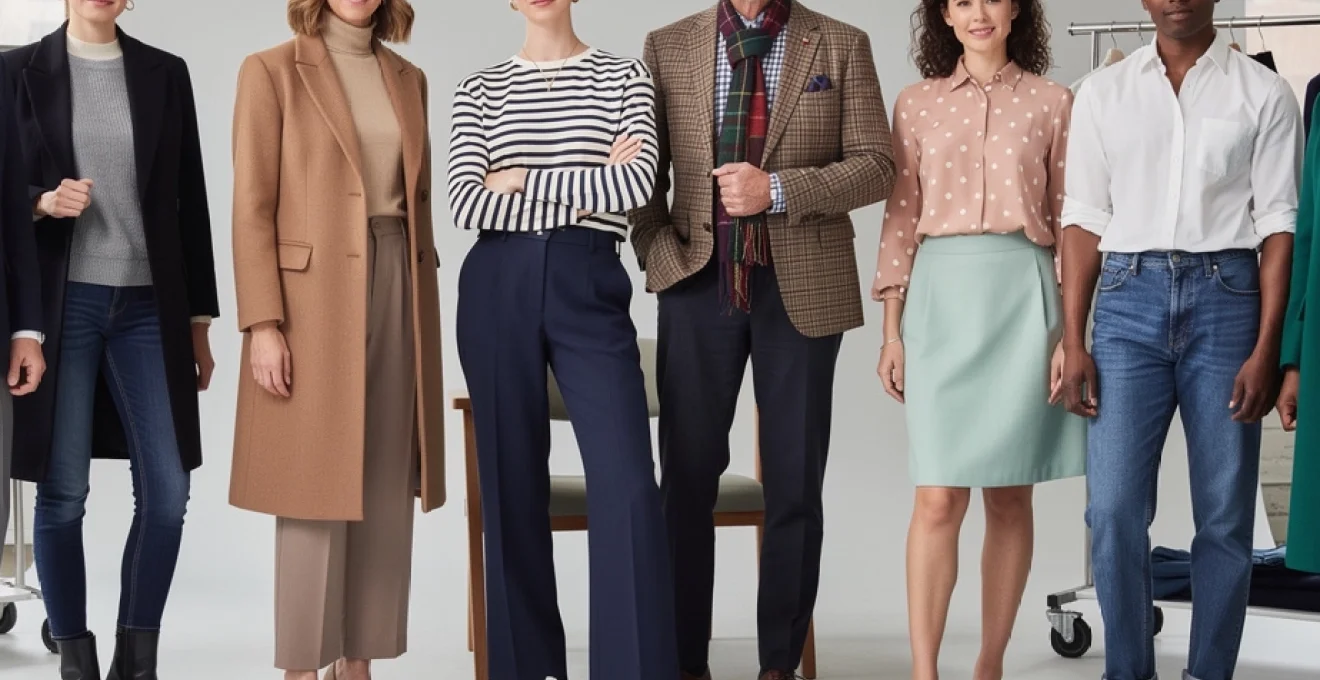
Heritage pattern pairings: stripes, checks, and tweed combinations
Heritage patterns – think stripes, checks, tweed, and polka dots – are fashion’s equivalent of architectural classics. Much like a well-designed building, they endure because their underlying structure is sound. These motifs have cycled through decades of style without losing relevance, in part because they balance visual interest with predictability. When you understand how to mix pattern scale, colour, and proportion, you can rely on these combinations to look considered rather than chaotic.
Incorporating heritage patterns into timeless outfit combinations is also an effective way to refresh your basics. A simple jeans-and-shirt look takes on new character when one element features a subtle stripe or check. The key is to think of patterns as spices in a recipe: a little goes a long way, and balance matters more than quantity. By grounding prints in a restrained colour palette and classic silhouettes, you create outfits that feel modern but never trend-dependent.
Breton stripes with solid bottoms: maritime-inspired styling
The Breton stripe is perhaps the most iconic example of a pattern that never dates. Originally worn by French sailors in the 19th century, it was later adopted by style icons such as Coco Chanel and Pablo Picasso, cementing its status as a wardrobe staple. Today, a navy-and-white striped top paired with solid trousers or denim offers an instant route to effortless, understated style. The linear pattern draws the eye across the body, creating a harmonious sense of balance on most body types.
To keep this maritime-inspired outfit combination timeless rather than costume-like, focus on simplicity and quality. Opt for a well-cut striped knit or T-shirt in a sturdy cotton or merino blend, and pair it with solid-colour bottoms: dark denim, navy chinos, white jeans, or tailored black trousers all work seamlessly. Accessories should be minimal yet intentional – leather loafers, white sneakers, or simple ballet flats keep the look grounded. By limiting the colour palette to two or three hues, you ensure the stripes remain the focal point without overwhelming the rest of your outfit.
Gingham and windowpane check integration techniques
Gingham and windowpane checks bring a softer, more approachable character to timeless outfit formulas. Gingham’s small, even squares lend a casual, almost nostalgic feel, making it ideal for shirts, dresses, and lightweight summer pieces. Windowpane checks, with their wide-spaced lines, feel sharper and more architectural, suiting blazers, trousers, and structured coats. When integrated thoughtfully, each pattern can act as the subtle hero of your outfit, providing interest without sacrificing versatility.
One reliable styling technique is to treat gingham as a neutral, especially in black, navy, or soft pastels. A gingham shirt under a solid blazer with straight-leg jeans is as dependable as a plain white shirt but more visually engaging. With windowpane checks, let the pattern appear on a single statement piece – a blazer or wide-leg trousers – and keep the rest of the look grounded in solid fabrics that pick up one of the colours in the grid. Ask yourself: does the eye know where to rest? If the answer is yes, your pattern integration is likely balanced and timeless.
Harris tweed and tartan pattern clash resolution methods
Harris tweed and tartan bring with them a strong sense of history and heritage, but they can feel busy if mishandled. Because both often incorporate multiple colours and complex weaves, wearing them together risks visual overload. The secret to resolving this potential pattern clash lies in hierarchy and harmony. You designate one pattern as dominant and the other as supporting, then link them through a shared colour and similar level of formality.
For instance, a classic Harris tweed blazer in muted browns and greens can sit comfortably over a subtle tartan scarf that echoes one of the blazer’s secondary colours. Keeping the tartan’s scale smaller and its colour contrast lower ensures it complements rather than competes. Grounding these textures with solid basics – dark denim, black trousers, or a simple knit – creates breathing space, much like white walls frame artwork in a gallery. By consciously repeating a single accent hue across both tweed and tartan, you produce a cohesive, timeless ensemble rather than a chaotic mix.
Polka dot scale matching with complementary solids
Polka dots may evoke playful, retro associations, but when styled with care they become a surprisingly sophisticated addition to a timeless wardrobe. The key factor is scale: micro-dots feel delicate and refined, while larger spots appear bolder and more whimsical. Selecting the right size for your personal style and context is essential. For everyday office wear, smaller polka dots on blouses, scarves, or ties usually read as more polished than oversized spots.
Complementary solids do the heavy lifting when it comes to grounding polka dots. A navy dress with white micro-dots, for example, pairs beautifully with a solid navy blazer and simple nude pumps, ensuring the pattern feels integrated rather than isolated. Matching the solid pieces to either the base colour or the dot colour creates a cohesive visual link. When in doubt, think of polka dots as you would jewellery: one statement piece is enough. Let the dotted item shine, and keep the rest of your outfit streamlined for a look that feels timeless rather than theatrical.
Seasonal colour theory applications in wardrobe coordination
Seasonal colour theory offers a practical framework for building timeless outfits that still feel in tune with the time of year. By aligning your wardrobe with the natural colours of each season – the rich earth tones of autumn, the soft pastels of spring, the crisp contrasts of summer, and the deep jewel tones of winter – you create looks that feel harmonious and intentional. This doesn’t require a complete wardrobe overhaul; rather, it’s about rotating key accent colours while keeping your core classics consistent.
Understanding these seasonal palettes also helps you shop more strategically. Instead of chasing every trend colour, you can prioritise hues that recur year after year and flatter your skin tone. Have you ever noticed how certain pieces seem to “work” effortlessly every time you wear them? Often, they align with both your personal colouring and the seasonal environment. Incorporating this awareness into outfit planning makes your timeless combinations feel alive and current, not static.
Autumnal burgundy and rust integration with earth tones
Burgundy and rust serve as quintessential autumn colours, echoing turning leaves and late-afternoon light. They pair beautifully with earth tones such as camel, olive, chocolate brown, and warm grey, creating outfit combinations that feel rich yet grounded. A burgundy knit layered under a camel coat with dark denim, for example, is a perennially stylish formula that can be refreshed year after year with small accessory tweaks.
To integrate these hues in a timeless way, treat them as accent colours anchored by neutral basics. Rust trousers with an oatmeal sweater and tan boots feel sophisticated rather than seasonal-novelty, especially when you keep silhouettes classic. Think straight-leg cuts, simple crew-neck knits, and tailored coats. If you are unsure how much burgundy or rust to introduce, start near the face with scarves or knitwear – this allows you to test how the colours interact with your complexion before investing in larger pieces.
Spring pastels: blush pink and mint green balancing acts
Spring pastels like blush pink and mint green evoke freshness and renewal, but they can feel overly sweet if not balanced correctly. The timeless approach is to offset their softness with structured silhouettes or grounding neutrals. A blush pink blouse under a navy blazer, for instance, combines delicacy with authority, making it suitable for both work and social settings. Similarly, mint trousers paired with a crisp white shirt and beige trench coat feel light yet composed.
Balance also comes from managing saturation and proportion. If you wear a pastel piece on the upper body, consider pairing it with a more muted or darker neutral on the lower half to avoid a “candy-coated” effect. Conversely, pastel accessories – a mint scarf, a blush bag – can soften a predominantly neutral outfit without overwhelming it. Think of pastels as you would pale watercolours on a page: they shine best when framed by areas of white space or quiet neutrals that let their subtlety come through.
Summer white and denim: weight and wash considerations
Few combinations feel as timelessly summery as white and denim. This pairing endures because it is clean, uncomplicated, and adaptable across age groups and style preferences. Yet the success of white-and-denim outfits often comes down to two technical details: fabric weight and wash. Lightweight white cotton, linen, or poplin breathes in hot weather, while mid-weight denim in a light to mid-blue wash keeps the look relaxed and seasonally appropriate.
For a polished take, pair a crisp white shirt with straight-leg mid-wash jeans and tan sandals or loafers, ensuring the shirt’s fabric is opaque enough to avoid transparency issues. If you prefer a more casual look, a white T-shirt with light-wash denim shorts or wide-leg jeans offers an easy, fail-safe option. Pay attention to contrast as well: bright optic whites feel more modern and graphic next to mid-blue denim, while softer off-whites create a gentler, coastal-inspired mood. Rotating between these variations allows you to refresh this classic combination without ever stepping outside a timeless aesthetic.
Winter jewel tones: emerald, sapphire, and ruby coordination
Winter invites deeper, more saturated colours, and jewel tones like emerald, sapphire, and ruby are particularly effective for creating timeless cold-weather outfits. These shades convey richness and depth, much like precious stones set against a dark velvet backdrop. When combined with classic winter fabrics – wool, cashmere, velvet, and structured cotton – they elevate even simple silhouettes. An emerald turtleneck with black tailored trousers, for example, is both striking and enduringly chic.
The key to coordinating jewel tones is restraint and repetition. Rather than mixing multiple intense colours in one look, choose a single hero hue and echo it subtly through accessories or makeup. Sapphire knitwear paired with charcoal or black outerwear, or a ruby scarf against a camel coat, introduces colour in a way that feels intentional rather than loud. Ask yourself: does the colour enhance the structure of the outfit, or distract from it? Used thoughtfully, jewel tones become tools for emphasis, drawing the eye to your best features while still fitting into a timeless wardrobe framework.
Investment piece anchoring: building outfits around quality staples
Timeless outfit combinations almost always revolve around one or two high-quality anchor pieces. These are the items you reach for repeatedly – a perfectly cut blazer, a versatile trench coat, well-made leather boots, or a pair of jeans that fits impeccably. Industry surveys consistently show that consumers who invest in fewer, better-quality garments wear them more often and for longer periods, which not only refines personal style but also reduces wardrobe clutter. In other words, investment pieces become the dependable “pillars” around which the rest of your outfits are built.
When you anchor your look around such staples, getting dressed becomes less about inventing new combinations and more about recombining trusted ones. A navy blazer can top a white T-shirt and jeans for the weekend, a silk blouse and tailored trousers for the office, or a slip dress for evening. The same applies to a classic trench or a cashmere crew-neck. To maximise their impact, choose investment pieces in neutral or deep classic colours (navy, black, camel, grey) and in silhouettes that are neither ultra-fitted nor overly oversized. This middle ground ensures they adapt smoothly as trends shift.
Fabric texture contrast principles for visual interest
Even the most classic outfit combinations benefit from thoughtful texture contrast. Texture is to clothing what seasoning is to food: you might not always notice when it is correct, but you immediately sense when it is missing. Combining smooth and matte fabrics with more tactile or lustrous ones prevents monochromatic or neutral outfits from appearing flat. A wool coat over a silk blouse with tailored wool trousers, for instance, feels far more interesting than three identical fabric finishes stacked together.
One practical guideline is to pair at least two distinct textures in any timeless outfit, especially when you are working within a narrow colour palette. Consider the interplay of denim and cashmere, crisp cotton and leather, linen and structured wool. Each fabric reflects light differently, creating subtle highlights and shadows that give the ensemble depth. For day-to-day dressing, you might ask: where do I want softness, and where do I need structure? Placing softer textures near the skin and more structured ones as outer layers often yields an outfit that is both comfortable and visually balanced.
Proportional balance techniques for different body silhouettes
Proportion may be the most critical, yet most overlooked, element in building timeless outfit combinations. Regardless of colour or trend, outfits that respect your body’s natural lines tend to look more elegant and feel more comfortable. Proportional balance revolves around how lengths and volumes interact: if you wear a voluminous piece on one half of the body, the other half usually benefits from a more streamlined silhouette. This is similar to interior design, where a large sofa is often balanced by lighter chairs or open space to avoid visual heaviness.
For individuals with a curvier or hourglass silhouette, defining the waist with tailored jackets, belted dresses, or high-rise trousers often supports balanced proportions. Those with a straighter frame might create shape through subtle volume – a structured blazer with shoulder definition over slim trousers, for example. Petite figures often benefit from higher waistlines and cropped or tailored hemlines that elongate the leg line, while taller individuals can experiment with longer coats and wide-leg trousers without overwhelming their frame. Ultimately, the most timeless outfit combinations are those in which you feel naturally at ease; when your clothing aligns with your proportions, you project confidence, and even the simplest jeans-and-shirt pairing can look remarkably polished.