The art of blending classic and contemporary elements in interior design has emerged as one of the most sophisticated approaches to creating truly personalised living spaces. Rather than committing to a single design era, this eclectic methodology allows homeowners to craft environments that reflect both heritage and progress, resulting in interiors that feel both timeless and refreshingly current. The practice requires a nuanced understanding of design principles, colour relationships, and spatial harmony to avoid creating spaces that appear disjointed or confused.
Successfully mixing periods demands more than simply placing antique furniture alongside modern accessories. True design mastery lies in understanding how different eras can complement rather than compete with each other, creating visual conversations between pieces that span decades or even centuries. This approach transforms homes from sterile showrooms into deeply personal sanctuaries that tell stories whilst maintaining contemporary functionality and aesthetic appeal.
Establishing your design foundation through colour theory and proportional balance
Creating a cohesive mixed-period interior begins with establishing a strong foundational framework that can accommodate diverse stylistic elements without appearing chaotic. The most successful eclectic spaces share common threads that unite disparate pieces, with colour serving as the primary unifying force. Professional designers consistently emphasise that colour creates visual harmony even when styles differ dramatically, making it the cornerstone of successful period mixing.
Applying the 60-30-10 rule for Classic-Modern colour schemes
The renowned 60-30-10 colour distribution principle provides an invaluable framework for balancing classic and modern elements within a single space. This approach allocates 60% of the room to a dominant neutral colour, 30% to a secondary shade, and 10% to accent colours that add personality and vibrancy. When mixing periods, this formula prevents visual overwhelm whilst allowing both traditional and contemporary pieces to shine within their designated colour allocations.
Implementing this rule effectively requires careful consideration of which era should dominate the colour story. If your space features significant period architecture, such as Georgian cornicing or Victorian fireplaces, these elements often dictate the primary colour choice. Contemporary additions then work within the established palette, creating seamless integration. Conversely, modern colour blocking techniques can provide the dominant visual framework, with classic pieces serving as sophisticated accent elements that add depth and character.
Understanding undertones in antique woods and contemporary metal finishes
The subtle undertones present in traditional materials often clash unexpectedly with modern finishes, creating discord that undermines the entire design scheme. Antique oak typically carries warm yellow undertones, whilst walnut leans towards cooler brown hues with purple inflections. Understanding these characteristics enables designers to select contemporary metal finishes that complement rather than compete with historical wood tones.
Contemporary brass fixtures harmonise beautifully with warm-toned antique woods, whilst brushed nickel and chrome work better alongside cooler vintage materials like teak or rosewood. The key lies in identifying whether your classic pieces skew warm or cool, then selecting modern elements that enhance these underlying characteristics. This approach creates visual coherence that transcends stylistic boundaries.
Creating visual weight distribution between heritage and modern pieces
Visual weight distribution plays a crucial role in achieving balanced mixed-period interiors. Heavy, ornate antique pieces can easily overwhelm sleek modern furniture if not carefully balanced throughout the space. Professional designers employ the principle of asymmetrical balance, where visually heavy items on one side of a room are counterbalanced by groupings of lighter pieces on the opposite side.
A substantial Victorian armoire, for instance, might be balanced by a cluster of contemporary sculptures and a modern floor lamp positioned strategically across the room. This distribution prevents any single element from dominating the space whilst maintaining visual interest and harmony. The goal is to create a sense of equilibrium that feels natural and unforced.
Implementing monochromatic bridges for seamless period integration
Monochromatic colour bridges serve as invisible connectors between disparate design periods, creating smooth transitions that guide the eye naturally throughout the space. These bridges might take the form of throw pillows that echo the colour of an antique rug, or contemporary artwork that picks up hues from traditional wallpaper patterns. The technique requires selecting one colour that appears
consistently across both classic and modern elements, then repeating it in varying tones and textures to weave the scheme together. For example, a deep indigo found in a Regency-era oil painting might reappear in the upholstery of a contemporary armchair, the glaze of a minimalist ceramic vase, and the border of a modern geometric rug. Although the forms and periods differ, the single-hue family acts like a visual “bridge”, ensuring that nothing feels out of place.
This monochromatic strategy is particularly effective when you are working with very ornate antiques or highly sculptural modern furniture. By keeping the colour story tight, you allow the silhouettes and craftsmanship of each piece to take centre stage without the distraction of competing hues. In practical terms, choose one hero colour, then introduce it in three to five different materials—such as velvet, glass, painted wood and metal—to create subtle repetition and a sense of calm continuity throughout your classic-meets-modern interior.
Strategic furniture selection and scale considerations
Once your colour and proportional foundations are in place, furniture selection becomes the next critical layer in mixing classic and modern pieces for a unique look. The relationship between scale, silhouette and function determines whether different design eras feel harmonious or jarringly mismatched. Professional designers analyse not only the style of each piece, but also its proportions relative to the room’s architecture and to neighbouring furniture.
In multi-era interiors, scale is often more important than style. A well-proportioned, large-scale modern sofa can coexist beautifully with a delicate antique side table, provided their heights and visual weights complement one another. By consciously curating furniture families—rather than buying items in isolation—you build rooms where Georgian, mid-century and contemporary designs can share the same stage without competing for attention.
Pairing georgian proportions with Mid-Century modern silhouettes
Georgian furniture is renowned for its balanced proportions, refined lines and restrained ornamentation, characteristics that surprisingly align well with the clean silhouettes of mid-century modern design. When pairing these two eras, focus on aligning heights, leg styles and overall visual weight. A slender-legged Georgian console, for example, can sit elegantly beneath a bold mid-century sunburst mirror, creating a dialogue between symmetry and dynamism.
To keep this combination from feeling like a museum display, integrate contemporary materials in subtle ways. You might reupholster a Georgian dining chair in a textured, mid-century inspired fabric, or place a teak sideboard against a wall painted in a historically informed but modernised heritage colour. The aim is to let the measured proportions of Georgian pieces ground the space, while the relaxed, organic forms of mid-century furniture introduce an inviting, lived-in quality.
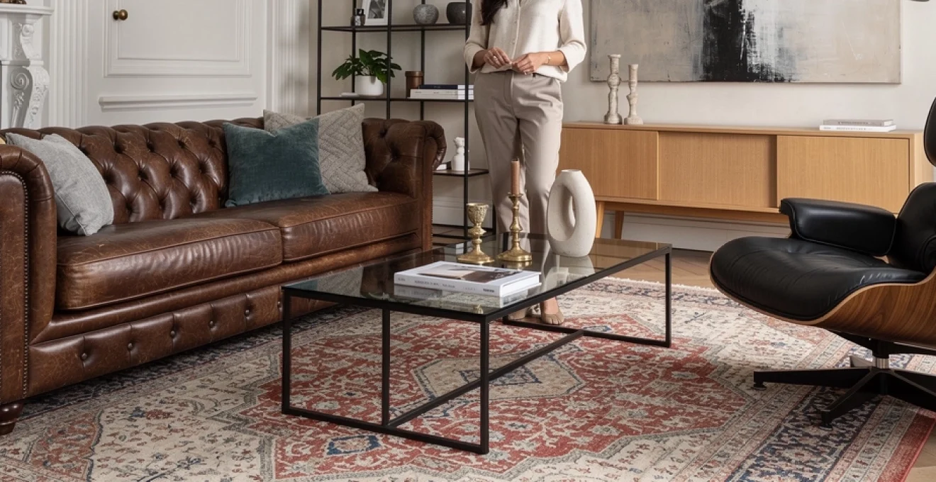
Selecting statement pieces: chesterfield sofas with eames lounge chairs
Few combinations capture the essence of classic-meets-modern interior design as powerfully as a deep-buttoned Chesterfield sofa paired with an iconic Eames Lounge Chair. The Chesterfield brings a sense of heritage, formality and tactile richness through its rolled arms and tufted leather, while the Eames offers ergonomic curves and a distinctly 20th-century sensibility. Together, they form a sophisticated focal point that anchors living spaces with personality and gravitas.
When placing these statement pieces, consider them as co-leads in your design narrative rather than competitors. Allow enough breathing space between them so each silhouette can be appreciated in full profile—ideally with a low, unobtrusive coffee table between or in front. To visually connect the two eras, repeat one element—such as leather, walnut veneer or a shared accent colour—in surrounding accessories like cushions, throws or side tables. This repetition acts like a visual “subtitle”, helping the eye understand that both pieces belong to the same story.
Incorporating vintage persian rugs with contemporary glass coffee tables
Vintage Persian rugs are invaluable tools for unifying classic and modern interiors because they introduce complex pattern, rich colour and a sense of history underfoot. When paired with a contemporary glass coffee table, you create a compelling contrast between intricate tradition and minimalist transparency. The glass allows the rug’s craftsmanship to remain fully visible, almost as if you are framing a piece of art on the floor.
To achieve balance, pay close attention to rug size and table proportion. A rug that is too small can make the seating area feel disjointed, while an oversized table can visually crush delicate patterns. As a general guideline, allow at least 20–30 centimetres of rug border visible around the coffee table to showcase the design. You can then echo one or two of the rug’s secondary colours in nearby modern elements—such as a metal lamp base or a lacquered sideboard—to integrate the piece seamlessly into your contemporary scheme.
Balancing ornate victorian details against minimalist scandinavian lines
Victorian design is known for its decorative exuberance—think carved wood, patterned wallpapers and elaborate fireplaces—whereas Scandinavian style is defined by simplicity, light and functional minimalism. Balancing these apparently opposing aesthetics can produce exceptionally characterful interiors when handled with care. The key is to allow one language to act as the “frame” and the other as the “content”, rather than letting both compete equally.
If you have original Victorian architectural details, such as ceiling roses or tiled hearths, treat them as a richly textured backdrop for streamlined Scandinavian furniture. Pale timber dining tables, linen-covered sofas and clean-lined storage pieces help visually “declutter” the space, allowing ornate period features to shine without overwhelming the room. Conversely, in a predominantly Scandi space, a single Victorian element—like an antique display cabinet or gilt-framed mirror—can act as a dramatic counterpoint, adding depth and narrative without disrupting the overall calm.
Textile integration techniques for period cohesion
Textiles operate like the connective tissue of a room, quietly linking classic and modern pieces through pattern, texture and tactility. Because fabrics and soft furnishings are relatively easy to update, they provide a flexible way to experiment with mixing eras without committing to major structural changes. Thoughtfully selected textiles can soften sharp contemporary lines, calm heavily ornamented antiques and introduce a consistent rhythm across seating, windows and floors.
Start by establishing a textile hierarchy: decide whether pattern, texture or colour will take the lead. In rooms with highly detailed architectural features or bold artwork, a more restrained textile palette—solid linens, wool knits and subtle herringbones—prevents visual overload. In simpler spaces, you can be braver with classic motifs such as damask, toile or paisley, then reinterpret them in modern scales or unexpected colourways to keep the look current.
One effective technique is to use historically inspired fabrics on modern forms and vice versa. For instance, upholstering a contemporary, low-profile sofa in a traditional houndstooth or ticking stripe instantly creates a bridge between design periods. Similarly, re-covering an antique chair in a plain, textured bouclé or cotton velvet strips away visual noise and allows the silhouette to feel fresh and relevant. Like a well-curated wardrobe, mixing “vintage” and “new season” fabrics helps your interior feel layered rather than themed.
Lighting design strategies for multi-era interiors
Lighting is often described as the “jewellery” of a room, and in mixed-period interiors it plays a crucial role in uniting classic and modern elements. Beyond its functional purpose, lighting controls mood, emphasises key features and can subtly shift the perceived style of a space. A traditional room lit exclusively by period-style fixtures may feel heavy, while the same architecture paired with sleek contemporary lighting can suddenly appear dynamic and relevant.
Successful multi-era lighting schemes typically combine three layers: ambient (general), task and accent lighting. Within each layer, you have the opportunity to alternate between classic and modern fixtures to create a sophisticated interplay. For example, a grand crystal chandelier might provide ambient light in a dining room, while sculptural contemporary wall lights and a minimalist table lamp introduce a modern edge. Conversely, in a very modern loft, you might add a pair of antique brass sconces to soften the industrial feel and introduce a sense of history.
Pay attention to finishes and bulb temperature when integrating lighting from different eras. Warm white LED bulbs (around 2700–3000K) tend to flatter traditional materials like wood and brass, while cooler temperatures can make them appear harsh. Unifying disparate fixtures through a shared metal finish—such as aged brass or matt black—creates cohesion even when the silhouettes vary widely. Think of these repeating finishes as the “rhythm section” in your lighting orchestra, keeping everything in harmony as styles solo above them.
Architectural element preservation and modern enhancement
The architecture of your space is the stage on which classic and modern pieces perform. Preserving original features while sensitively introducing contemporary interventions is often what elevates a mixed-period interior from pleasant to exceptional. Exposed beams, panelled doors, ornate coving and original floorboards all carry a narrative that can be amplified—not erased—by modern design choices.
Rather than covering or disguising heritage elements, consider how you can highlight them through contrast. Painting traditional mouldings in a crisp, modern white against deeper wall colours can sharpen their profile, while a frameless glass balustrade can showcase an original staircase without visual interruption. In kitchens and bathrooms, where modern functionality is essential, pairing classic materials like marble or metro tiles with handleless cabinetry or integrated appliances creates a dialogue between past and present.
Proportion is critical here: oversized contemporary interventions can swamp delicate period details, while overly literal “heritage” additions may feel inauthentic in a new build. Before making changes, study the existing architecture—ceiling heights, window shapes, cornice depth—and let those cues inform the scale of new elements. By treating the building’s bones with respect and using modern additions to clarify rather than compete, you create interiors that feel both rooted and forward-looking.
Accessory curation and styling methodologies
Accessories are where your personality shines through, and they are often the easiest way to mix classic and modern pieces for a unique look without major investment. However, without a clear strategy, shelves and surfaces can quickly become cluttered or visually chaotic. Curating accessories with intent—editing as much as you add—is essential to maintaining balance in multi-era interiors.
One effective methodology is to style in “vignettes”: small, self-contained groupings that tell a story. On a contemporary sideboard, for example, you might cluster a vintage ceramic vase, a stack of modern art books and a sleek metal sculpture, united by a shared colour or material. Varying heights and shapes within each vignette adds dynamism, while leaving negative space around the arrangement prevents it from feeling crowded. As a general rule, fewer larger accessories often look more sophisticated than many tiny ones scattered throughout the room.
Books, artwork and personal collections are particularly powerful tools for bridging eras. An antique oil painting can feel unexpectedly fresh when hung within a gallery wall of minimalist prints, while a modern abstract canvas above a traditional chest of drawers creates instant tension and interest. When in doubt, apply the same principles you would use in fashion styling: repeat a key “accent” three times in a room—perhaps a particular shade of blue, a brass finish or a curved form—so that your eye recognises a deliberate pattern rather than random accumulation. Through careful curation, your accessories become the final, expressive layer that stitches your classic and modern design narrative together.