The modern sophisticated wardrobe transcends the traditional boundaries of conservative neutrals, embracing pattern and print as essential elements of contemporary elegance. Today’s discerning professionals recognise that incorporating prints into their sartorial repertoire isn’t merely about following trends—it’s about developing a refined understanding of how visual elements can enhance personal style whilst maintaining professional credibility. The art of print integration demands both strategic thinking and aesthetic sensibility, requiring consideration of scale, colour harmony, and contextual appropriateness.
Mastering print integration involves understanding the delicate balance between visual interest and sophistication. Whether you’re navigating boardroom presentations or attending evening soirées, the strategic use of patterns can elevate your wardrobe from merely functional to genuinely distinctive. This sophisticated approach to print requires moving beyond basic guidelines to embrace nuanced understanding of fabric, texture, and design principles that create lasting impact.
Understanding print categories and pattern classifications in contemporary fashion
Contemporary fashion presents an extensive taxonomy of prints, each carrying distinct visual weight and cultural associations. Understanding these classifications enables informed decision-making when curating a sophisticated wardrobe that balances visual interest with professional appropriateness. The foundation of print literacy begins with recognising how different pattern categories serve specific functions within a wardrobe ecosystem.
Pattern classification extends beyond simple categorisation to encompass considerations of cultural heritage, manufacturing techniques, and seasonal relevance. Modern print selection requires appreciation for both traditional motifs and contemporary interpretations, recognising how designers recontextualise classic patterns for current aesthetic preferences.
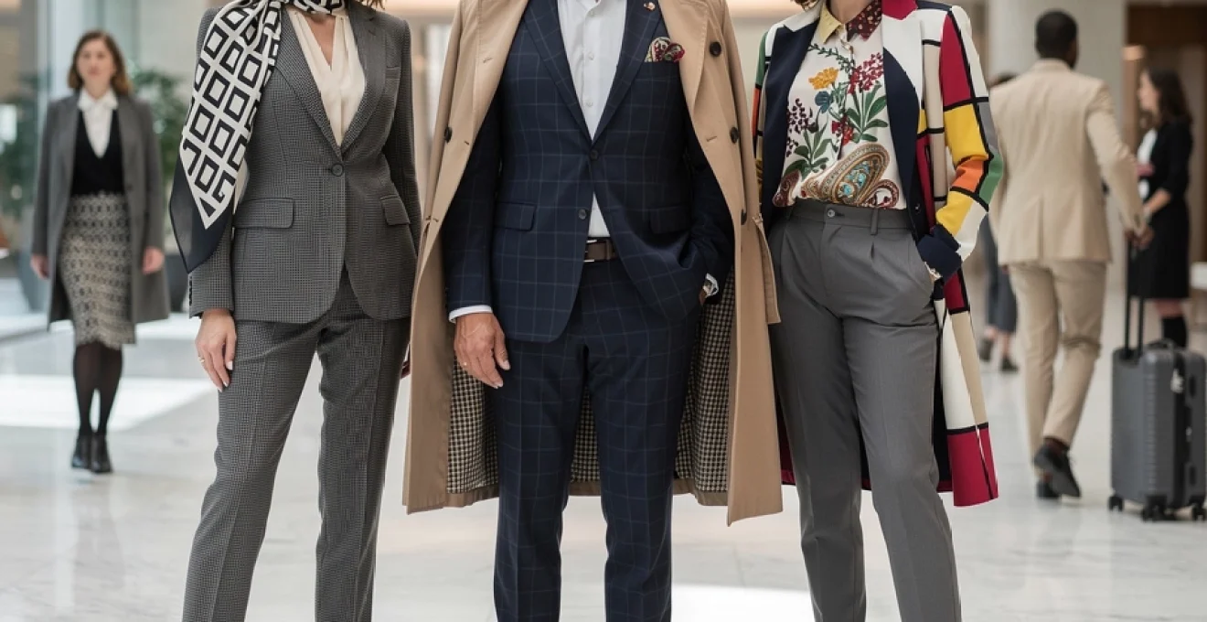
Geometric patterns: houndstooth, glen plaid, and windowpane check integration
Geometric patterns represent the architectural foundation of sophisticated print wardrobes, offering structured visual elements that convey authority and precision. Houndstooth, with its distinctive broken check pattern, provides versatility across professional settings whilst maintaining visual sophistication. The pattern’s mathematical precision creates optical movement that flatters most body types whilst remaining appropriate for conservative environments.
Glen plaid combines multiple geometric elements—typically featuring a large plaid pattern overprinted with a smaller check—creating depth and complexity without overwhelming visual impact. This pattern’s Scottish heritage lends traditional credibility whilst its modern interpretations offer contemporary relevance. Windowpane check patterns provide subtle structure through their grid-like formations, creating understated sophistication that works particularly well in business casual environments.
Botanical motifs: liberty of london florals and paisley heritage designs
Botanical prints require careful consideration of scale, colour saturation, and placement to maintain sophistication whilst embracing feminine elements. Liberty of London florals exemplify refined botanical design through their intricate compositions and sophisticated colour palettes. These prints demonstrate how traditional motifs can be reinterpreted for contemporary wardrobes without sacrificing elegance or professional appropriateness.
Paisley patterns, rooted in Persian and Indian textile traditions, offer exotic sophistication when executed in refined colourways and appropriate scales. Modern interpretations of paisley focus on simplified forms and muted tones that integrate seamlessly into professional wardrobes whilst maintaining the pattern’s inherent visual interest and cultural richness.
Abstract expressionist prints: Mondrian-Inspired colour blocking and art nouveau revival
Abstract prints provide opportunities for artistic expression within sophisticated wardrobes, particularly when drawing inspiration from established art movements. Mondrian-inspired colour blocking translates fine art principles into wearable design, using geometric forms and primary colours to create striking visual statements that remain appropriate for creative professional environments.
Art Nouveau revival prints incorporate organic forms and flowing lines that suggest natural movement whilst maintaining design sophistication. These patterns work particularly well in silk scarves and blouses, where the fluid fabric complements the pattern’s inherent movement and creates dynamic visual interest without overwhelming the wearer’s professional presence.
Animal print sophistication: leopard, zebra, and snake skin pattern refinement
Animal prints demand sophisticated handling to avoid appearing costume-like or inappropriate for professional settings. Leopard print, when executed in refined colourways such as chocolate brown and cream or navy and grey, can provide exotic sophistication that enhances rather than detracts from professional credibility. The key lies in selecting prints with appropriate scale and colour sat
uration.
Zebra and snake prints require particularly careful curation within a sophisticated wardrobe. Opt for stylised, slightly abstract interpretations rather than hyper-realistic animal skin reproductions, and prioritise pieces in restrained palettes such as charcoal, taupe, or deep olive. When integrated as accent elements—a silk blouse beneath a structured blazer, a belt, or a pair of pumps—these prints can function almost like textured neutrals, adding depth without visual noise. The more dramatic the motif, the more minimal the silhouette should be to preserve refinement.
Strategic print mixing techniques and colour theory applications
Once you understand individual patterns, the next step is mastering how to combine prints with intention. Strategic print mixing relies on clear principles: consistent colour stories, deliberate scale contrast, and respect for the overall print-to-solid ratio. Rather than approaching print mixing as a risky fashion experiment, you can treat it as a calculated design exercise grounded in colour theory and visual balance.
Incorporating prints into a sophisticated wardrobe becomes significantly easier when you apply the same logic an interior designer uses when styling a room. You establish a dominant element, add a secondary supporting motif, and finish with subtle accents. This layered approach ensures that even bold combinations feel coherent and elevated, rather than chaotic or trend-driven.
Monochromatic print layering with tonal variation principles
Monochromatic print layering is one of the most foolproof ways to experiment with pattern while maintaining a polished, professional image. By working within a single colour family—such as navy, charcoal, or ivory—you reduce the risk of visual discord and allow print scale and texture to take centre stage. Tonal variation, from the lightest tint to the deepest shade, creates depth and sophistication without overwhelming the eye.
For example, pairing a charcoal micro-check blouse with a deep graphite pinstripe trouser and a smooth solid black blazer results in a multi-print ensemble that still reads as quietly luxurious. You can think of this strategy as building a black-and-white photograph rather than a full-colour painting: the interest comes from contrast in value and pattern density rather than bold hues. This approach is particularly effective if you work in conservative environments but still want to incorporate prints into your daily rotation.
Complementary pattern scaling: large-to-small motif progression methods
Successful print mixing also depends on complementary pattern scaling—the deliberate pairing of large and small motifs to create harmony. When every pattern in an outfit is similar in size, the eye struggles to know where to focus, resulting in visual clutter. By contrast, a clear large-to-small motif progression provides a focal point and supporting elements, much like a well-composed photograph.
A practical method is to designate one garment as the “hero” piece with the largest print, such as a midi skirt in a bold windowpane or oversize floral. You then layer in smaller-scale prints—perhaps a fine herringbone blazer or a micro-dot silk blouse—that echo a colour from the hero pattern. This hierarchy of scale ensures that prints complement one another instead of competing, and it allows you to incorporate prints into a sophisticated wardrobe without sacrificing clarity or structure.
Colour wheel harmonisation for multi-print ensemble construction
Colour theory is your most reliable tool when constructing multi-print outfits that feel intentional rather than experimental. Working with the colour wheel, you can choose analogous schemes (neighbouring hues such as blue, teal, and green) for subtle harmony, or complementary schemes (opposite hues such as navy and rust) for controlled contrast. The goal is not to memorise complex theory but to understand which colour relationships create calm versus energy.
When mixing prints, start by identifying the dominant colour in your main pattern and then choosing secondary prints that either sit next to that colour on the wheel or directly across from it. For instance, a navy-and-cream stripe pairs effortlessly with a soft sage botanical print (analogous harmony), while a muted terracotta paisley scarf introduces a sophisticated complementary accent. Ask yourself: does each additional print support the main colour story, or does it introduce an entirely new narrative? If it is the latter, the ensemble may feel disjointed rather than refined.
Texture contrast integration: matte versus lustrous print combinations
Texture plays a subtle but powerful role in how prints are perceived, especially in a professional or evening wardrobe. Combining matte and lustrous surfaces—such as wool suiting with silk satin or crisp cotton with fluid crepe—can refine even bold prints by giving the eye multiple layers of interest. This interplay of textures often determines whether a printed look feels luxurious or loud.
Consider pairing a matte, softly brushed glen plaid trouser with a lustrous silk blouse in a delicate abstract print; the sheen of the silk lifts the outfit while the matte wool grounds it. The principle is similar to pairing glossy lipstick with a matte complexion: the contrast highlights both elements without tipping into excess. When in doubt, allow only one highly reflective printed piece in an outfit and keep the remaining patterns and solids in matte or semi-matte finishes to preserve a sophisticated balance.
Seasonal print selection and fabric weight considerations
Seasonality is a crucial yet often overlooked factor when incorporating prints into a sophisticated wardrobe. The same motif can feel completely different depending on fabric weight, drape, and colour saturation. Light, airy prints in breathable fabrics such as cotton voile, silk georgette, and linen blends tend to suit spring and summer, while denser prints in wool, cashmere, and heavier silk twill feel more appropriate for autumn and winter.
In warmer months, you might lean towards softer colour palettes and more open, spacious prints that leave room for negative space, mirroring the lighter layers you wear. Think Liberty-inspired florals on silk blouses, subtle ikat motifs on linen dresses, or fine stripes on cotton poplin shirts. As temperatures drop, you can shift to richer hues and denser patterns, such as deep-toned paisleys on silk scarves, houndstooth wool coats, and tartan skirts that visually “anchor” layered outfits. This seasonal calibration ensures your printed pieces feel intentional rather than arbitrary across the year.
Investment piece strategy: designer print selection from hermès, gucci, and burberry
When you start investing in high-end prints from heritage fashion houses, strategy becomes essential. Iconic prints from brands such as Hermès, Gucci, and Burberry carry strong visual identities and cultural weight; they can instantly elevate a minimalist wardrobe but also risk overpowering it if not chosen thoughtfully. The aim is to select designer prints that will remain relevant long after specific trends have passed.
Hermès silk scarves, for example, offer intricate equestrian, geometric, and botanical motifs crafted with exceptional colour nuance. One well-chosen scarf can function as a belt, hair accessory, necktie, or bag accent, providing a high cost-per-wear return on investment. Burberry’s classic check, particularly in its original neutral tartan, operates almost like a refined neutral when used sparingly, such as in a trench lining or scarf. Gucci’s historical flora prints and interlocking monogram can be most sophisticated in smaller accessories—loafers, belts, or silk blouses—where they reference brand heritage without dominating the entire look.
Before committing to an investment print, ask yourself: can this piece integrate into at least five existing outfits in my wardrobe, and will it still feel relevant in five years? Prioritise classic colourways, medium-scale motifs, and versatile formats (scarves, blouses, structured bags) over highly seasonal, logo-heavy items. By treating designer prints as long-term style assets rather than quick-status purchases, you build a sophisticated wardrobe that feels intentional, cohesive, and distinctly your own.
Professional wardrobe print integration for executive dressing
In professional settings, print strategy becomes as much about perception and authority as it is about aesthetics. Incorporating prints into a sophisticated wardrobe for executive dressing means balancing personality with gravitas. The right pattern can signal creativity, cultural awareness, and attention to detail, while an ill-considered motif may distract from your message or undermine your professional presence.
Understanding your specific industry norms is crucial. Finance, law, and corporate leadership roles often call for more understated, micro-scale prints and restrained colour palettes. By contrast, creative and media sectors can accommodate bolder, more expressive patterns. Regardless of sector, the goal remains the same: ensure that any print supports your communication rather than competes with it.
Boardroom-appropriate micro-print selection and placement techniques
In boardroom environments, micro-prints are your most reliable allies. Fine pinstripes, micro-checks, subtle dobby weaves, and tonal jacquards add depth to suiting without drawing undue attention. Placement is equally important: prints that sit close to the face—on shirts, blouses, and ties—should be calm and harmonious, as they frame your expressions during high-stakes conversations and presentations.
A tailored navy suit in a near-solid birdseye weave, paired with a white shirt featuring a barely-there geometric micro-print, communicates polish and attention to detail. You might also consider printed linings in blazers or coats as a discreet way to express personality that only reveals itself when you remove your jacket. Think of these micro-prints as the well-designed typography of your outfit: subtle, legible, and professional, yet far from boring.
Client-facing role print protocol: conservative pattern guidelines
For client-facing roles where trust and clarity are paramount, conservative pattern guidelines can help you avoid distractions. High-contrast, novelty, or overtly whimsical prints may unintentionally shift focus from your expertise to your outfit. Instead, lean on classic stripes, small-scale checks, and restrained florals in neutral or muted colour palettes.
When in doubt, ask yourself whether the print could plausibly appear in a high-end corporate uniform collection. If the answer is yes, the pattern is likely safe for most client meetings. Keeping prints below the waist—such as a subtle plaid skirt or checked trousers paired with a solid top—can also be a strategic choice, as it allows your face and upper body to remain the focal point in seated discussions or video calls.
Creative industry print expression: maximalist approach for design professionals
In creative industries, prints can operate as an extension of your portfolio, signalling your aesthetic sensibility before you say a word. Here, a more maximalist approach is not only acceptable but often expected. However, maximalism within a sophisticated wardrobe still requires discipline: intentional colour stories, coherent themes, and sharp tailoring are what separate artistic expression from visual chaos.
You might combine a boldly printed kimono jacket with a graphic tee and tailored trousers, or layer a photographic-print skirt under a textured knit in a coordinating hue. The key is to treat prints like layers in a moodboard, all contributing to a single narrative—whether that is “modernist minimal,” “retro romantic,” or “global eclectic.” Even when you push boundaries, maintaining one or two solid, grounding elements in each outfit will preserve a sense of professional structure.
International business travel print considerations and cultural sensitivity
When travelling for international business, print choices require additional care. Motifs that seem benign in one culture can carry unexpected symbolism or associations in another. Bold political slogans, religious iconography, or region-specific symbols are best avoided unless you are certain of their connotations. Instead, favour abstract, geometric, or nature-inspired prints that are less likely to miscommunicate.
Pragmatically, you also want travel-friendly printed pieces that resist creasing and coordinate easily with a capsule of solids. A printed silk scarf in a neutral palette can revive multiple outfits, while a patterned shirt dress in a non-creasing fabric can transition from meetings to dinners with minimal styling changes. When planning your wardrobe, imagine each printed item passing through different cultural lenses; if it reads as respectful, polished, and adaptable, it is likely a strong candidate for your suitcase.
Styling framework: print-to-solid ratio mathematics and visual balance
To consistently incorporate prints into a sophisticated wardrobe, it helps to rely on a simple, repeatable framework. One effective approach is to think in terms of print-to-solid ratios, much like a designer might balance colour percentages in a graphic layout. This “wardrobe mathematics” prevents overloading an outfit with competing elements and makes it easier to experiment with new patterns.
A practical guideline is the 70–20–10 rule: allocate roughly 70% of your outfit to solid neutrals, 20% to one dominant print, and 10% to a secondary, subtler pattern or accent. For example, a charcoal trouser and black blazer (70%), a striped silk blouse (20%), and a patterned scarf or shoe (10%) create a balanced composition. As your confidence grows, you can occasionally invert the ratio for social events—making the print the 70% and solids the supporting 30%—while keeping silhouettes streamlined to maintain elegance.
Visual balance also involves considering where prints sit on the body. If you prefer to draw attention upward, place your primary pattern near the face and keep the lower half in solids; if you prefer to minimise the upper body, reverse this logic. Over time, this framework becomes intuitive, allowing you to curate a sophisticated print wardrobe that feels both expressive and impeccably composed, day after day.