Printed shoes have emerged as one of the most transformative accessories in contemporary fashion, offering an instant way to elevate any outfit from mundane to memorable. Yet many fashion enthusiasts find themselves hesitating at the boutique entrance, overwhelmed by the prospect of incorporating bold patterns into their carefully curated wardrobes. The secret lies not in avoiding these statement pieces altogether, but in understanding the nuanced art of balanced styling that allows printed footwear to shine without overwhelming your entire aesthetic.
The modern fashion landscape has witnessed a remarkable evolution in printed shoe designs, from subtle textural patterns that whisper sophistication to bold geometric prints that command attention. This versatility means that virtually every style preference can find its perfect printed match, whether you gravitate towards minimalist elegance or embrace maximalist expression. The key challenge isn’t finding printed shoes that appeal to you—it’s learning to style them with confidence and restraint.
Understanding print shoe categories and pattern classifications
The foundation of successful printed shoe styling begins with understanding the vast spectrum of pattern categories available in today’s market. Each pattern type carries its own visual weight, cultural associations, and styling requirements that influence how you should integrate them into your wardrobe. From delicate florals to bold animal prints, the choice of pattern significantly impacts the overall aesthetic direction of your outfit.
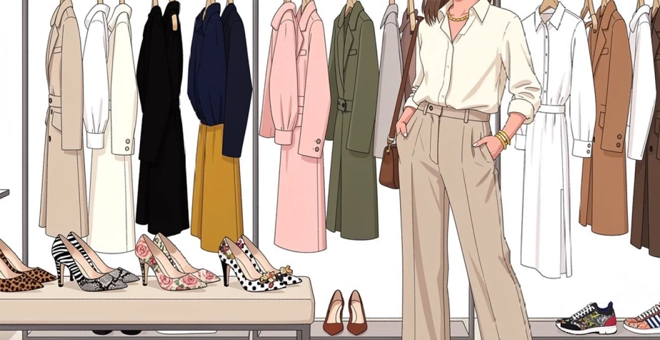
Animal print variations: leopard, zebra, and snake textures
Animal prints represent perhaps the most recognisable and versatile category in printed footwear, with each variation offering distinct styling possibilities. Leopard print shoes, characterised by their irregular spotted patterns in warm tones, function remarkably well as neutral accessories despite their bold appearance. The organic nature of leopard spots means they complement both structured and flowing garments, making them an excellent entry point for print-shy individuals.
Snake print footwear presents a more refined approach to animal-inspired patterns, typically featuring scales in monochromatic or dual-tone colourways. These shoes work particularly well in professional settings when styled thoughtfully, as the pattern’s linear nature creates visual interest without overwhelming formal attire. Snake print loafers have become increasingly popular among style-conscious professionals who want to inject personality into their work wardrobes without compromising on sophistication.
Zebra stripes offer the boldest option within animal prints, creating dramatic contrast through their high-impact black and white pattern. These shoes require careful consideration of outfit balance, as their graphic nature can easily dominate softer patterns or compete with other statement pieces. The key to styling zebra print shoes lies in treating them as the primary focal point whilst keeping other elements relatively subdued.
Floral motifs: rose, paisley, and botanical designs
Floral printed shoes embody femininity and seasonal charm, with variations ranging from delicate watercolour botanicals to bold tropical blooms. Rose patterns typically feature romantic, curved lines that soften angular silhouettes and complement both vintage-inspired and contemporary styling. The scale of floral motifs significantly affects their visual impact—smaller, scattered blooms create texture rather than bold statements, whilst larger florals demand more careful outfit coordination.
Paisley patterns bring an element of bohemian sophistication to printed footwear, with their intricate teardrop shapes creating visual richness that works beautifully with solid colours. These prints often incorporate multiple colours within a single design, offering numerous coordination opportunities with existing wardrobe pieces. The traditional nature of paisley patterns makes them particularly suitable for transitional styling between seasons.
Contemporary botanical designs encompass everything from abstract leaf patterns to photorealistic garden imagery. These prints often feature unexpected colour combinations that can inspire entire outfit palettes, encouraging creative styling approaches that might not otherwise occur. Botanical print shoes work exceptionally well with natural fabrics and earth-toned accessories, creating cohesive looks that feel both modern and timeless.
Geometric patterns: polka dots, stripes, and abstract prints
Geometric patterns offer structured visual interest that complements clean-lined clothing and architectural silhouettes. Polka dot shoes represent a playful yet sophisticated option that works across multiple style categories, from retro-inspired looks to contemporary minimalism. The size and spacing of dots significantly influence their styling applications—smaller dots create subtle texture
that reads as understated texture, while oversized, high-contrast dots feel immediately retro and bold. When styling polka dot shoes, consider echoing the dot scale somewhere else in your look—a small printed scarf or dotted blouse—without matching it exactly, to avoid a costume-like effect.
Striped shoes introduce linear energy to an outfit, guiding the eye either along the length of the foot (vertical stripes) or across it (horizontal stripes). Narrow stripes in similar tones tend to look more refined and office-appropriate, whereas wide, contrasting stripes skew casual and graphic. Abstract geometric prints—chevrons, broken lines, or irregular grids—sit between classic and avant-garde, making them ideal for those who enjoy architectural clothing or minimalist silhouettes with a twist.
Digital print technologies: sublimation vs screen printing effects
Beyond the pattern itself, the way a print is applied to your shoes dramatically influences how it looks and wears over time. Sublimation printing uses heat to fuse dye into synthetic materials, resulting in highly detailed, photographic-quality designs that feel smooth to the touch. This method is often used for digital florals, abstract art-inspired motifs, and photo-real animal prints, making it perfect if you love intricate, multi-coloured shoes that still feel sleek and lightweight.
Screen printing, by contrast, layers ink onto the surface of the material through stencils, creating bold, saturated colours with a slightly raised texture. Because each colour requires its own screen, screen-printed shoes often feature fewer hues but stronger graphic impact—think classic stripes, polka dots, or pop-art motifs. From a styling perspective, sublimated prints tend to blend more easily into outfits because of their soft edges and tonal gradations, while screen-printed designs behave like graphic statements that demand cleaner surrounding lines.
Texture plays a role here too. A snake print created through embossing and digital printing will feel and look different from a flat, screen-printed version of the same pattern. When you are deciding how to style printed shoes without overdoing it, consider not only the colours and pattern scale, but also whether the finish is matte, glossy, or textured—gloss and high contrast read as “louder,” while matte and tonal effects read as more subtle.
Colour coordination techniques for printed footwear
Once you understand the main categories of printed shoes, the next step is mastering colour coordination so your outfits look intentional rather than improvised. Colour is often what makes printed footwear feel intimidating, especially when multiple shades appear in a single design. By applying a few simple colour strategies, you can confidently pair even the boldest patterns with your existing wardrobe and avoid visual overload.
Monochromatic styling with tonal matching principles
Monochromatic styling—dressing in variations of a single colour family—is one of the easiest ways to style printed shoes without overdoing it. When your clothing stays within a tight tonal range, even a complex print feels harmonious, because all the hues are already “speaking the same language.” For instance, pairing navy trousers, a midnight blue shirt, and a slate blazer with navy-and-cream striped loafers creates a refined, elongated look that still benefits from subtle pattern play.
To apply tonal matching principles, start by identifying the dominant colour in your printed shoes, then build your outfit around lighter and darker variations of that shade. You can think of it like adjusting the brightness on a photo: same colour, different intensity. This works particularly well with floral print heels or geometric pumps that feature one main hue plus a few accent colours. Because the overall palette is unified, the print reads as an extension of your outfit rather than a competing element.
If you are worried about monochrome feeling flat, introduce texture instead of more colour—ribbed knits, suede bags, or a tweed blazer in the same colour family add depth without visual noise. This approach is especially powerful in professional settings, where you may want your printed shoes to show personality while your silhouette remains polished and restrained.
Complementary colour theory application in print integration
For those who enjoy bolder combinations, complementary colour theory—pairing colours opposite each other on the colour wheel, such as blue and orange or red and green—can create dynamic yet balanced outfits. When you wear printed shoes that feature a complementary scheme, you can echo one of those opposites in your clothing and let the other colour appear only in the shoe. This technique gives you a sense of cohesion without tipping into chaos.
Imagine a pair of snake print heels in teal and rust. You might choose a rust dress and camel trench, allowing the teal in the shoes to act as a surprising accent. Conversely, you could wear deep teal trousers and a cream blouse, with the rust tones in your footwear tying everything together. Because complementary colours naturally heighten each other’s intensity, it is wise to keep at least one of the pair in a muted or darker version when dressing for the office or more formal events.
If colour wheels feel abstract, think of complementary styling like seasoning a dish: a little contrast brings the flavour (or outfit) to life, but too much salt or spice overwhelms the recipe. When in doubt, keep your clothing in softer, desaturated versions of the hues in your printed shoes—a dusty rose instead of hot pink, a muted sage instead of neon green—to maintain balance.
Neutral base layering with statement print shoes
Building your look on a neutral base is one of the most foolproof strategies for styling statement print shoes. Neutrals—black, white, grey, navy, beige, tan, and certain shades of olive—act like a blank canvas that allows your footwear to take centre stage. A simple combination such as a white shirt, straight-leg jeans, and a beige trench instantly becomes more memorable when you add leopard print pumps or zebra loafers.
To keep neutral outfits from feeling too stark, pay attention to undertones. Cool neutrals (charcoal, crisp white, blue-based navy) tend to flatter prints that include blues, purples, greys, or cool reds. Warm neutrals (camel, ivory, warm taupe) complement prints with browns, oranges, yellows, or warm pinks. When your base neutrals and your printed shoes share similar undertones, the entire look feels curated rather than random.
This approach is especially effective if your wardrobe already leans minimalist. Instead of overhauling your closet, you can introduce one or two pairs of printed shoes—a floral heel, a snake print loafer, a polka dot flat—and rotate them through your existing jeans, tailored trousers, and solid dresses. The result is a series of outfits that look fresh and intentional, with minimal effort on your part.
Accent colour extraction from multi-coloured print designs
Multi-coloured prints can be intimidating because they offer so many possible directions. An easy way to tame them is by “extracting” one accent colour from the print and repeating it elsewhere in your outfit. For example, if your botanical print sneakers feature green, lilac, and cream, you might choose a lilac sweater or a sage-green blazer to echo just one of those tones. This creates a visual rhythm that feels deliberate, even if the rest of your look is composed of simple neutrals.
To apply this method, take a moment to study your printed shoes and identify three groups: the background colour, the accent colours, and any tiny highlight shades. Use the background colour as a guide for your bottoms or outerwear, and pick one accent to repeat near your face—a blouse, scarf, or piece of jewellery. The smallest highlight shades (like a sliver of yellow in a floral) are usually best left only in the shoe, acting like a subtle spark rather than a full theme.
This strategy works particularly well when you want to restyle the same pair of printed shoes multiple ways. On one day, you might pull out the coral from a tropical print and pair it with a coral tee; on another, you might highlight the navy from that same shoe with tailored navy trousers and a white shirt. By shifting which accent you emphasise, you dramatically increase outfit variety without buying more footwear.
Wardrobe integration strategies for statement footwear
Owning striking printed shoes is one thing; integrating them seamlessly into your everyday wardrobe is another. Many people fall into the trap of treating printed footwear as “special occasion only,” leaving beautiful pieces underused. With a few practical strategies, you can weave statement shoes into your weekly rotation, from workdays to weekends, while still feeling polished and put together.
Minimalist clothing selection to balance print intensity
When your shoes are visually busy, your clothing often works best when it is conceptually simple. Minimalist pieces—clean-cut blazers, straight-leg jeans, shift dresses, or tailored shirts—act as a calm backdrop for bold footwear. This does not mean dressing in plain black from head to toe; rather, it means choosing garments with uncomplicated shapes and limited embellishment so the overall outfit remains balanced.
Think of bold printed shoes as the lead actor and your clothes as the supporting cast. A floral stiletto paired with a classic black sheath dress feels chic and intentional, whereas the same shoe worn with a ruffled, embroidered dress in another print might cross into costume territory. If you are experimenting with prints for the first time, aim for a ratio where the shoes provide most of the visual interest and the rest of your outfit remains streamlined.
Over time, as your confidence grows, you can gently increase complexity—perhaps adding a textured blazer, a subtle pinstripe shirt, or a delicate patterned scarf. The goal is not to avoid personality in your clothing, but to make sure each element plays a clear role so your look feels cohesive rather than chaotic.
Texture mixing: combining prints with solid fabrics
One of the easiest ways to keep printed shoes from feeling overpowering is to surround them with rich, tactile solids. Denims, linens, silks, tweeds, and knits all offer subtle visual interest without adding more pattern. When you pair snake print loafers with raw-hem jeans and a chunky knit sweater, for instance, the different textures create depth, allowing the print to stand out without dominating.
Texture mixing works especially well in neutral or tonal outfits where you might otherwise worry about looking flat. A monochrome cream look—silk blouse, wool trousers, and a structured coat—gains instant character when finished with leopard print heels, because the shoe’s pattern contrasts with the softness of the fabrics. In this way, texture becomes your secret styling tool, letting you keep colours controlled while still achieving a visually engaging result.
If you are unsure how far to go, start with one hero texture near your shoes, such as cropped leather trousers with striped trainers, then build simpler textures upward. This “heavier at the bottom, lighter at the top” approach anchors your print and prevents the outfit from feeling top-heavy or cluttered.
Proportional styling rules for different print scales
Print scale—how large or small the motifs are—plays a critical role in how your shoes interact with the rest of your outfit. As a rule of thumb, larger, high-contrast prints feel bolder and more casual, while smaller, low-contrast prints behave almost like solids. When styling printed shoes without overdoing it, you can use scale the way you might use volume in music: adjust it up or down depending on the occasion.
If your shoes feature a large-scale pattern, such as oversized florals or wide stripes, aim to keep the rest of your outfit either print-free or limited to much smaller, subtler patterns. A tiny pinstripe blazer with large floral pumps can work because the scales are clearly different, whereas pairing two large prints often feels chaotic. Conversely, shoes with a fine leopard or micro-dot pattern can be safely combined with medium-scale prints elsewhere, like a plaid blazer or a striped tee, provided the colour palettes align.
Length and silhouette matter too. Cropped trousers or midi skirts naturally frame your shoes and give them more attention; full-length trousers that skim the vamp of the shoe tone down their impact. If you want your printed footwear to be the star, choose hemlines that reveal the ankle and keep leg lines clean. If you prefer a more discreet effect, let longer hemlines partially cover the shoe, allowing just flashes of print as you move.
Seasonal adaptation: summer florals vs winter geometric prints
Seasonality offers another helpful filter for when and how to wear printed shoes. Light, airy florals and tropical motifs tend to feel most at home in spring and summer, especially in fabrics like canvas, linen, or raffia. Paired with cotton dresses, denim shorts, or flowy skirts, these prints mirror the energy of warmer months and blend easily into casual or smart-casual settings.
In autumn and winter, geometric prints, plaids, and darker animal prints usually integrate more effortlessly with heavier fabrics and layered outfits. A houndstooth ankle boot or a dark snake print heel sits comfortably alongside wool coats, leather trousers, and chunky knits. These patterns also tend to work well in professional environments, as their structured lines echo the tailored silhouettes common in colder-weather wardrobes.
Of course, you are not strictly limited by season. You can transition summer florals into autumn by pairing them with deeper base colours—think floral heels with burgundy trousers and a navy blazer—or bring geometric prints into spring with lighter fabrics and pastel tones. The key is to adjust both the surrounding colours and textures so that your printed shoes feel like an intentional part of the seasonal story you are telling.
Professional styling applications for printed shoes
In many workplaces, printed shoes represent a subtle way to express individuality while respecting dress codes. The challenge is finding the balance between creativity and professionalism, especially in more conservative industries. The good news is that, with thoughtful choices, you can wear printed footwear to the office, client meetings, and industry events without appearing overly casual or distracting.
Start by opting for classic silhouettes—pumps, loafers, low-block heels, or sleek ankle boots—instead of highly trend-driven shapes. A snake print loafer or a houndstooth pump in muted tones often feels more boardroom-appropriate than a neon floral stiletto, even if both are technically printed. Keep heel heights moderate and avoid overly glossy finishes if your workplace leans traditional; matte leather or suede prints tend to read as more refined.
Next, let your shoes provide the primary interest in an otherwise streamlined outfit. A navy suit with a white blouse becomes instantly more modern when you swap plain black pumps for subtle leopard heels. Similarly, a charcoal sheath dress paired with black-and-white geometric flats sends a message of attention to detail without shouting for attention. If you have an important presentation, you might even use the accent colour in your shoes—say, a hint of burgundy—to coordinate your lipstick or a minimalist necklace, creating a cohesive, confident impression.
For more creative or business-casual environments, you can push the boundaries a little further. Floral print heels with a tailored blazer and dark denim can feel both approachable and polished for client lunches or networking events. Printed sneakers, when impeccably clean and paired with sharp separates like cigarette trousers and a crisp shirt, may also be acceptable in industries such as tech, design, or media. As always, observe what leaders and peers in your organisation wear; then use printed shoes to step one notch above, not several.
Occasion-specific print shoe styling guidelines
Different occasions call for different levels of subtlety and impact, and printed shoes can help you hit the right note each time. For daytime casual outings—brunches, errands, coffee dates—comfort often comes first, so printed flats, espadrilles, or low-heeled sandals are ideal. Pair animal print sneakers with jeans and a white tee, or floral espadrilles with a simple sundress, to add personality without sacrificing ease.
For evening events, weddings, or cocktail parties, printed heels or embellished patterned sandals deliver a sense of celebration. Here, you can afford a bit more drama: metallic accents, richer colours, and higher contrast prints tend to photograph beautifully under low light. To avoid clashing with event dress codes, anchor your look with one solid-coloured hero piece—a sleek jumpsuit, a satin slip dress, or a tailored tuxedo-style suit—and let the shoes provide the visual flourish.
Work-related occasions, such as conferences or client presentations, usually benefit from a more restrained approach. Choose darker or more muted prints, like burgundy snake boots, navy polka dot pumps, or black-and-white geometric loafers. Combine them with structured separates in complementary tones so that your footwear reads as a thoughtful detail rather than the focal point of your entire ensemble. If you are travelling for business, a single pair of versatile printed shoes—perhaps in a neutral animal print—can elevate multiple outfits without taking up valuable suitcase space.
Finally, for special statement moments—photoshoots, milestone birthdays, or fashion-forward events—you can lean into bolder combinations. Consider pairing a striking shoe, such as zebra stilettos or brightly coloured graphic heels, with another carefully chosen print elsewhere in your outfit, following the scale and colour rules discussed earlier. The aim is to look intentional and expressive, not accidental; planning the look in advance and trying it on in good lighting will help you gauge whether the balance feels right.
Common styling mistakes and print overload prevention
While printed shoes can be incredibly versatile, a few common missteps often lead to outfits that feel “too much.” One frequent issue is combining several high-contrast elements—bold shoes, busy clothing prints, bright colours, and heavy accessories—all at once. When everything is shouting, nothing stands out. Instead, decide what you want the eye to notice first (often the shoes), and allow other elements to play supporting roles in quieter tones or simpler textures.
Another pitfall is ignoring context. A pair of neon floral sneakers might be perfect for a weekend festival but appear out of place in a conservative office or formal dinner setting. Before reaching for your most eye-catching shoes, ask yourself where you are going, who you will see, and what message you want your outfit to send. You can always downshift to a more subdued print or a lower-contrast colour palette when the occasion calls for subtlety.
Fit and proportion also matter more than many people realise. Oversized, bulky shoes in loud prints can visually shorten the leg and overwhelm petite frames, while extremely delicate printed sandals might look unbalanced with heavy winter layers. Aim to match the visual weight of your shoes to the rest of your outfit: chunkier prints pair well with structured denim or coats, while refined patterns complement lighter fabrics and sleeker silhouettes.
To prevent print overload, adopt a simple checklist before leaving the house. Ask yourself: Is there a clear focal point? Are the colours harmonious or intentionally contrasting? Does the print scale on my shoes differ enough from any other patterns I am wearing? And most importantly, do I feel like myself in this outfit? When you can answer “yes” to those questions, you are styling printed shoes in a way that enhances, rather than overwhelms, your personal style.