The power of colour extends far beyond simple aesthetic preference. When you wear a shade that harmonises with your natural colouring, you project confidence, vitality, and authenticity. Conversely, wearing disharmonious colours can emphasise imperfections, create visual fatigue, and diminish your overall presence. The strategic use of bold, daring colours represents one of the most transformative tools available in personal styling, capable of reshaping how others perceive you and how you perceive yourself. Understanding the science behind colour interaction with skin tone, the psychological impact of chromatic choices, and the technical application of vivid hues can revolutionise your wardrobe and elevate your personal brand. This comprehensive exploration reveals how daring colours, when applied with knowledge and intention, create visual impact that transcends fleeting fashion trends.
Colour theory fundamentals: understanding undertones, saturation, and chromatic impact on personal styling
The foundation of effective colour usage begins with understanding the technical properties that make certain shades harmonious with your natural colouring whilst others create discord. Colour theory, originally developed by artists and later adapted for personal styling, provides a systematic framework for understanding these relationships. The three primary dimensions of colour—hue, value, and chroma—interact with your skin’s undertones, hair colour, and eye colour to create either harmony or contrast. When you grasp these fundamental principles, you can make informed decisions about which daring colours will amplify your natural features rather than competing with them.
Warm versus cool undertones: identifying your natural skin’s chromatic base
Your skin’s undertone represents the subtle hue beneath the surface that remains constant regardless of sun exposure or temporary skin conditions. Determining whether you possess warm (yellow, peachy, or golden), cool (pink, red, or blue), or neutral (a balance of both) undertones forms the cornerstone of personalised colour analysis. The vein test offers a quick assessment: if the veins on your inner wrist appear greenish, you likely have warm undertones; if they appear blue or purple, you’re probably cool-toned. Jewellery preference provides another indicator—warm-toned individuals typically find gold more flattering, whilst cool-toned people shine in silver. Understanding your undertone prevents the common mistake of selecting colours based solely on personal preference rather than what genuinely complements your natural colouring.
High-saturation pigments: how vivid hues create visual dominance in wardrobe composition
Saturation refers to the intensity or purity of a colour, ranging from highly vivid to completely desaturated (grey). High-saturation colours—think electric blue, vibrant fuchsia, or brilliant emerald—command attention and create strong visual statements. These pigments contain minimal grey, resulting in pure, powerful chromatic expression. When you wear highly saturated colours, you harness their ability to draw the eye, create focal points, and project energy. However, high-saturation shades also amplify any disharmony with your natural colouring. A colour analyst from Toronto notes that before offering online consultations, clients would fly internationally specifically to determine which high-saturation colours enhanced rather than overwhelmed their appearance. The transformative potential of correctly chosen vivid hues explains this dedication—the right saturated colour can make you appear more vibrant, confident, and memorable.
The munsell colour system applied to fashion: measuring hue, value, and chroma for outfit selection
Developed by artist Albert H. Munsell in the early twentieth century, the Munsell colour system provides a three-dimensional framework for precisely describing colours. Hue identifies the colour family (red, yellow, green, blue, purple), value measures lightness or darkness, and chroma indicates saturation or intensity. This system’s application to personal styling allows for nuanced understanding beyond simple colour names. For instance, “red” encompasses countless variations—from a light, desaturated rose pink to a deep, highly saturated crimson. When you understand that your colouring harmonises with specific combinations of hue, value, and chroma, you can select daring colours with precision. A winter-toned individual might thrive in high-value, high-chroma royal purple, whilst a summer-toned person achieves harmony with medium-value,
medium-chroma berry red that feels softer and more blended. Applying the Munsell perspective helps you refine daring colours so they feel intentional rather than random experiments.
Instead of asking, “Can I wear yellow?” you begin to ask, “Which hue of yellow (green-yellow or orange-yellow), at what value (pale, mid, or deep), and at what chroma (buttery soft or highlighter-bright) works with my colouring?” This is the difference between a wardrobe full of almost-right pieces and one where each bold colour feels like it belongs to you. Over time, you will notice that the daring colours that work best share very similar Munsell profiles, giving you a reliable blueprint for future purchases.
Simultaneous contrast effect: how adjacent colours alter perceived skin tone and facial features
Simultaneous contrast describes how a colour is influenced by the colours placed next to it. Your eye does not see a colour in isolation; it constantly compares it to its surroundings and subtly adjusts perception. This is why the same red lipstick can appear deeper next to a white blouse and brighter next to a black turtleneck. On the face, simultaneous contrast can either enhance natural warmth in your complexion or drag out unwanted sallowness, redness, or shadows.
When you place a daring colour near your face—on a neckline, scarf, or blazer lapel—it interacts with your skin tone through this effect. A cool cobalt top may make cool undertones appear clearer and more luminous, while the same shade on a warm undertone can highlight ruddiness or under-eye darkness. Conversely, an intensely warm coral near the face of a cool-toned person can make the skin appear greyed or tired. Understanding simultaneous contrast enables you to test bold colours more intelligently: observe not just the garment, but how your skin, eyes, and facial contours appear in relation to it.
To experiment, stand in natural daylight with minimal makeup and hold different daring colours close to your face. Notice which shades make your eyes sparkle, your teeth appear whiter, and your skin more even—these are signs of positive simultaneous contrast. Shades that emphasise texture, redness, shadows, or fine lines are likely working against your natural colouring. This simple, science-backed test helps you separate powerful statement colours from those that overpower you.
Strategic placement of bold chromas: focal points, proportional balance, and silhouette enhancement
Once you understand which daring colours harmonise with your colouring, the next step is deciding where to place them on your body. Strategic placement of bold chromas can shape how others perceive your proportions, draw attention to your favourite features, and even alter the apparent width or height of your silhouette. Think of colour as a spotlight: where you put the brightest, most saturated hues is where the eye will go first.
If you love vibrant colour but feel unsure about wearing it head-to-toe, focusing daring shades on specific garment zones or accessories allows you to ease in gradually. Used thoughtfully, colour becomes a subtle sculpting tool, similar to contouring in makeup. You can visually lift the face, balance the shoulders and hips, or streamline the midsection simply by shifting where bold colours appear within your outfit.
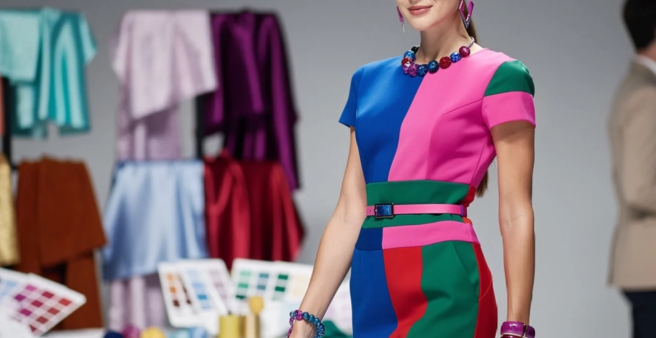
Colour blocking techniques: creating geometric visual interest through contrasting panels
Colour blocking—the use of large, solid areas of contrasting colours within a single outfit—remains one of the most effective ways to integrate daring hues. By arranging bold colours in geometric shapes or panels, you introduce strong visual structure that can either echo or counterbalance your body lines. Vertical panels of high-saturation colour, for instance, create an elongating effect, while wide horizontal bands can broaden and stabilise a silhouette.
Designers often use colour blocking to visually redraw proportions. A dress with a darker side panel and a bright central column can create the illusion of a slimmer waist and longer torso. A top with bright shoulders and a darker body draws the eye upward, ideal if you want to emphasise your face and upper body. This is fashion’s equivalent of architectural design: by placing colour “blocks” in the right locations, you can reshape how your body is perceived without altering the actual fit.
For everyday dressing, you can apply colour blocking through separates rather than relying on designer pieces. Pair a daring magenta top with deep navy trousers, or combine a vivid emerald skirt with a charcoal grey knit. Even a bold blazer over a contrasting dress counts as colour blocking. The key is clear separation between colour zones and deliberate contrast that looks intentional rather than accidental.
Accent positioning: using cobalt blue, fuchsia, or emerald green at necklines and accessories
If you are not ready to commit to full garments in daring colours, strategic accents offer a low-risk entry point. Placing high-saturation hues close to your face maximises their transformative potential because this is the area where people naturally focus. A cobalt blue scarf, emerald statement earrings, or a fuchsia lipstick can have more impact on your overall look than a brightly coloured skirt worn far from the face.
Necklines are especially powerful zones for chromatic focus. A V-neck in a bold colour draws the eye towards the centre of the body and can lengthen the neck and torso, while a jewel neckline in a vivid hue frames the face like a picture. Accessories such as glasses frames, necklaces, and headbands also serve as compact colour vehicles. A cool-toned person may find that a slim silver chain with a sapphire pendant feels both striking and harmonious, whereas a warm-toned individual might prefer a gold chain with a rich amber or topaz stone.
Think of these accents as punctuation in your outfit. A mostly neutral look gains energy and personality when you introduce a single, deliberate pop of daring colour. This approach is particularly effective for professional environments where full-bright suiting may feel too bold, but you still want to project modernity and presence.
The 60-30-10 rule adapted for daring palettes: balancing dominant, secondary, and accent colours
The 60-30-10 rule, often used in interior design, adapts beautifully to dressing with bold colours. In this framework, approximately 60% of your outfit is a dominant colour (often a neutral or softer tone), 30% is a secondary colour that supports the main hue, and 10% is a high-impact accent. This ratio ensures visual balance, preventing daring colours from competing with each other or overwhelming your natural colouring.
Applied to fashion, you might choose charcoal trousers and a soft grey blazer as your 60%, a dusky teal blouse as the 30%, and a pop of electric blue in your earrings or shoes as the 10%. Alternatively, a cream dress (60%), tan belt and boots (30%), and a statement fuchsia bag (10%) offer a bolder, yet still cohesive, approach. The rule is not a rigid formula but a helpful guide to manage intensity and create harmony when using strong colour.
Using this structure, you can gradually increase or decrease your daring colour quotient without losing balance. On days when you want extra impact—perhaps for a presentation or event—you might let the secondary colour be more saturated while still keeping the 60% base calm and grounding. This method allows experimentation with high-saturation shades within a controlled, flattering framework.
Vertical versus horizontal chromatic distribution: elongating or broadening visual perception
The direction in which you distribute colour significantly influences how your body is perceived. Vertical distribution—where a single colour or tonal range runs from shoulders to hem—creates uninterrupted lines that visually lengthen the body. A column of bold colour, such as a red dress or a matching cobalt top and trousers, can make you appear taller and slimmer, particularly when the hue is consistent in value from top to bottom.
Horizontal distribution places blocks of different colours across the body: a bright top with dark trousers, or a contrasting band at the hem of a skirt. Wide horizontal stripes or sharply contrasting colour breaks at the bust, waist, or hip can visually broaden these areas. Sometimes this is desirable—for example, adding volume to the upper body of a pear-shaped figure through a bright, light top and darker bottom.
When working with daring colours, it helps to ask: “Where do I want to add presence, and where do I prefer subtlety?” If you want to emphasise height and create a sleek effect, limit colour changes and keep bolder chromas aligned vertically. If your goal is to balance proportions—broadening shoulders, emphasising a waist, or grounding a tall frame—use horizontal blocks of daring colour strategically. In both cases, the perceived shape is guided as much by colour placement as by cut.
Seasonal colour analysis integration: tailoring vibrant shades to spring, summer, autumn, and winter palettes
Seasonal colour analysis groups individuals into palettes—Spring, Summer, Autumn, and Winter—based on undertone, value contrast, and chroma. Rather than dictating rigid rules, these palettes provide curated families of colours that naturally harmonise with your features. Within each season, daring colours can be selected and refined so they feel aligned with your natural colouring rather than imposed upon it.
Think of seasonal analysis as a filter applied to the full spectrum of bold colours. Every season has its own version of red, blue, green, and pink—what changes is the temperature, depth, and intensity. When you adapt daring hues to your seasonal palette, you retain visual impact while preserving the sense that your outfit and your face belong together.
Winter palette transformation: incorporating true red, royal purple, and icy magenta
Winter palettes are characterised by cool undertones, high contrast, and clear, vivid colours. People in this category often have striking combinations such as dark hair with light skin, or bright eyes against a neutral complexion. For Winters, daring colours are not only possible—they are essential for expressing the full potential of their natural drama. True red, royal purple, and icy magenta are quintessential Winter brights.
True red for a Winter leans blue rather than orange, resembling a classic pillar-box or lipstick red. Royal purple has a cool, blue-based undertone and benefits from high chroma; it looks luxurious in satin or velvet. Icy magenta, which is both bright and slightly frosted, can appear in knits, silk blouses, or lip colour. These hues work particularly well in clean, tailored silhouettes and crisp fabrics that match Winter’s clear, defined colouring.
To avoid overpowering even a Winter colouring, it can be helpful to anchor these bold shades with in-palette neutrals such as black, charcoal, optic white, or navy. A true red blazer over a white shirt and black trousers looks intentional and polished, whereas pairing the same blazer with a warm camel may create discord. By keeping lines sharp and contrasts deliberate, Winters can wear some of the most daring colours in the spectrum whilst still appearing refined.
Spring chromatic strategy: utilising coral, turquoise, and golden yellow for radiant looks
Spring palettes are warm, clear, and light-to-medium in value. The look is often described as fresh, radiant, and youthful, with peachy undertones, golden hair, or sparkling warm eyes. For Springs, daring colours need to retain this sense of clarity and warmth. Coral, turquoise, and golden yellow are standout options that can instantly brighten the entire face.
Spring corals blend pink and orange with a clear, warm base—they are neither dusty nor neon. Worn near the face as tops, scarves, or lipstick, they echo the natural flush in Spring complexions. Turquoise for Springs should be bright and slightly warm, more like a tropical sea than a deep teal. Golden yellow—resembling daffodils or marigolds—works best in lighter, luminous fabrics that allow light to pass through, such as cotton voile or silk.
When building outfits, Springs benefit from pairing daring colours with other clear, warm tones rather than heavy, dark neutrals. Instead of black, they might choose warm navy, camel, light tan, or ivory as grounding elements. A turquoise blouse with light camel trousers and a coral necklace feels harmonious and vibrant, while the same blouse with harsh black may overpower Spring’s delicate brightness.
Autumn colour amplification: elevating burnt orange, teal, and rust for warmth-dominant complexions
Autumn palettes are warm, rich, and often low to medium in contrast. Think of the colours of falling leaves, spices, and deep forests. Individuals in this category often have golden or olive undertones, red or auburn hair, and eyes in shades of hazel, green, or warm brown. For Autumns, daring colours are earthy yet intense: burnt orange, deep teal, and rust are particularly flattering.
Burnt orange and rust share a strong red-yellow base that mirrors Autumn complexions, especially when rendered in textured fabrics like suede, tweed, or chunky knit. Teal, when sufficiently deep and warm, creates a striking contrast with golden skin and copper hair without feeling too sharp. These bold colours work well in substantial garments such as coats, boots, and leather accessories, reflecting Autumn’s grounded energy.
Because Autumn palettes thrive on depth, pairing daring shades with equally rich supporting colours maintains coherence. A rust dress with chocolate boots and an olive jacket creates a luxurious column of warm, muted intensity. In contrast, combining Autumn brights with icy pastels may dilute their impact and clash with the wearer’s natural warmth. Choosing matte or slightly brushed textures further softens saturation, ensuring bold colours feel enveloping rather than loud.
Summer palette evolution: softening bold colours with lavender, powder blue, and rose pink variations
Summer palettes are cool, soft, and often low contrast, with an overall impression of gentleness and subtlety. Skin tends to have blue or rosy undertones, hair may be ash blonde or soft brown, and eye colours are frequently muted blue, grey, or soft hazel. For Summers, daring colours must be adapted so they remain cool and slightly veiled. Lavender, powder blue, and rose pink provide a way to embrace statement colour without sacrificing harmony.
Lavender for Summers is light and slightly greyed, like a flower petal rather than a neon purple. Powder blue echoes a hazy sky and flatters the natural coolness in Summer complexions, especially near the face. Rose pink, with a blue undertone and medium value, can be surprisingly impactful while still feeling sophisticated. These shades may not be “daring” in the same way as electric neon, yet on a Summer they read as strong, refined statements.
To avoid appearing washed out, Summers can use tonal layering of these soft brights—pairing rose pink with dove grey, or lavender with soft navy. The key is maintaining coolness and softness across the outfit. High-shine fabrics can be used sparingly to increase impact; for example, a silky powder blue blouse under a matte blazer adds depth without harshness. In this way, Summers can evolve their palette towards bolder expression while staying true to their inherent delicacy.
Psychological impact of chromatic choices: confidence projection, mood alteration, and social perception
Daring colours influence not only how you look but also how you feel and how others respond to you. Colour psychology research indicates that hues such as red and bright yellow can increase heart rate and perceived energy, while blues and greens tend to promote calm and trust. When you intentionally select bold colours aligned with your intentions for the day—authority, approachability, creativity—you harness colour as a non-verbal communication tool.
For instance, wearing a strong red blazer to a negotiation or presentation can reinforce feelings of confidence and assertiveness, both in yourself and in your audience. Choosing a vivid teal or cobalt for networking events may signal modernity and openness, encouraging conversation. On the other hand, softer daring colours like lavender or dusty rose can project empathy and approachability, useful in client-facing or caregiving professions.
Interestingly, studies on “enclothed cognition” suggest that what we wear can change our internal state, not just external perception. Slipping into a favourite daring dress or sharply coloured shirt can become a ritual that shifts you into a more focused, optimistic, or courageous mindset. Over time, consistently positive experiences while wearing certain bold hues reinforce this association, turning specific colours into personal power tools.
Material and texture interaction with vivid pigmentation: how fabric composition affects colour intensity
The same daring colour can appear dramatically different depending on the fabric and finish that carry it. Material acts like a lens, altering how light interacts with pigment. Smooth, reflective surfaces magnify brightness, while matte or textured fabrics absorb light and soften the hue. Understanding these interactions allows you to calibrate the intensity of bold colours, making them more or less striking according to your comfort level and context.
When planning a wardrobe that uses daring colours effectively, it helps to think not only in terms of hue but also in terms of surface quality. A high-shine red satin dress will always read more dramatic than the same red in a brushed cotton. By choosing fabrics that match both your personality and your colour season, you can refine impact without changing the underlying shade.
Silk and satin finishes: amplifying luminosity in jewel tones like sapphire and ruby red
Silk, satin, and other glossy finishes inherently reflect more light, which intensifies perceived chroma. Jewel tones such as sapphire, ruby red, and emerald become richer and more luminous on these surfaces, often appearing deeper and more saturated than on matte fabrics. For many, this is precisely the appeal: high-shine jewel tones create a sense of luxury, occasion, and presence.
However, this amplification means that you should choose these combinations with care. On someone whose colouring already has high contrast and clarity (such as a Winter palette), a sapphire satin blouse can look stunning, drawing attention to the eyes and hair. On softer, lower-contrast colour types, the same blouse might dominate, making the wearer feel as if the garment is entering the room before they do. In professional settings, you might reserve high-shine vivid tones for smaller areas—such as a camisole under a blazer or a silk scarf—rather than full garments.
If you are drawn to jewel tones but unsure about intensity, testing them in diffused lighting can help. Observe whether your features remain the focal point, or whether the fabric steals attention. When the balance feels right, you have likely found the correct pairing of hue, value, and sheen for your personal style and context.
Matte textiles: controlling vibrancy in mustard yellow, forest green, and crimson applications
Matte fabrics such as cotton, linen, flannel, and many wools absorb more light, which naturally mutes even strong pigments. This quality makes them excellent vehicles for daring colours that you want to feel grounded and wearable rather than loud. Mustard yellow, forest green, and crimson, for example, can seem intense in theory but become surprisingly approachable in matte finishes.
Matte textures are particularly beneficial for warm, earthy palettes such as Autumn and some Springs, where overly glossy finishes can feel at odds with the natural softness of the colouring. A forest green wool coat, mustard corduroy trousers, or a crimson brushed-cotton shirt will often look richer and more sophisticated than their high-shine equivalents. The colours remain bold but gain depth and subtlety, similar to the difference between direct sunlight and golden hour light.
For those easing into daring colours, starting with matte fabrics is often the most comfortable route. You can experiment with larger areas of strong colour—such as full-length trousers or coats—because the finish prevents them from dominating. Later, if you crave more drama, you can introduce selective shine through accessories or layered pieces.
Metallic threads and sequins: combining reflective surfaces with electric blue and hot pink
Metallic threads, sequins, and high-reflective embellishments take colour intensity to another level by adding both shine and texture. When combined with already vivid hues such as electric blue or hot pink, they create maximum visual impact, ideal for eveningwear, performance settings, or occasions where you want to be unmistakably seen. Under artificial lighting, these materials catch and scatter light, causing colours to shift and sparkle as you move.
Because these effects are so strong, placement and scale become critical. A fully sequinned hot pink dress will dominate any space, which may be perfect for a party but overwhelming for a dinner with colleagues. Alternatively, a simple black outfit elevated with electric blue metallic shoes or a hot pink sequinned clutch allows you to enjoy the energy of these tones without committing your entire silhouette to them.
One useful approach is to treat metallic vivid colours as visual exclamation marks. Use them sparingly, at points where you want the eye to land—at the feet, along the neckline, or in jewellery near the face. This ensures that they enhance rather than distract from your features and the overall line of your outfit.
Cultural and contemporary references: from yves saint laurent’s mondrian collection to valentino pink PP phenomenon
Daring colours have long been used by designers to challenge conventions, express cultural shifts, and crystallise particular moments in fashion history. In the 1960s, Yves Saint Laurent’s Mondrian collection translated the bold primary blocks of Dutch painter Piet Mondrian into structured shift dresses. The collection demonstrated how pure red, blue, and yellow, framed by stark black lines, could create wearable art—proving that high-contrast colour blocking could be both modern and elegant.
More recently, Valentino’s Pink PP collection, unveiled in 2022, showcased a single, highly saturated fuchsia-pink shade across almost every garment and accessory on the runway. This monochromatic approach transformed a daring colour into a complete visual universe, illustrating how a single hue, when used consistently, can become a brand signature and cultural talking point. The collection also normalised head-to-toe bold colour for a wider audience, inspiring countless high-street interpretations.
We also see daring colour stories in popular media and street style. Television series and films use wardrobe palettes to convey character traits—soft pastels for innocence, dark jewel tones for power, neon accents for rebellion. On social platforms, creators often rely on striking colours to stand out in crowded feeds, thereby accelerating the mainstream acceptance of vivid palettes. As a result, colours once considered too loud for everyday wear now appear in office attire, loungewear, and even minimalist wardrobes, albeit adapted to different personal palettes.
When you incorporate daring colours into your own style, you participate in this evolving cultural conversation. Whether you channel the graphic precision of Mondrian colour blocking or experiment with a personal “signature shade” à la Pink PP, you are using colour not just as decoration, but as a language. By aligning that language with your natural colouring, body shape, and personality, daring colours become a powerful tool to transform your overall look with confidence and intention.