The relationship between jewellery and skin tone extends far beyond personal preference, representing a sophisticated understanding of colour theory and visual harmony. When precious metals and gemstones complement your natural undertones, they create an immediate enhancement effect that elevates both the wearer’s complexion and the jewellery itself. This symbiotic relationship between skin and adornment has been recognised across cultures for millennia, with ancient civilisations developing intricate knowledge of how different materials interact with various skin pigmentations.
Modern colour analysis techniques have transformed this intuitive knowledge into a precise science, offering concrete guidelines for selecting jewellery that maximises visual impact. The correct metal choice can make skin appear more radiant, eyes more vibrant, and overall appearance more polished. Conversely, incompatible selections can create unflattering contrasts that diminish both the wearer’s natural beauty and the jewellery’s inherent appeal.
Understanding skin undertones through professional colour analysis
Professional colour analysis forms the foundation of effective jewellery selection, requiring careful examination of the pigmentation beneath your skin’s surface. Unlike surface tone, which can change due to sun exposure or seasonal variations, undertones remain constant throughout your lifetime. These underlying hues create the framework that determines which metals and gemstones will create harmonious or discordant visual relationships with your complexion.
The science behind undertone analysis involves understanding how light reflects off your skin and interacts with surrounding colours. When jewellery metals complement these natural undertones, they create what colour theorists call “sympathetic resonance” – a visual harmony that enhances both elements simultaneously. This principle explains why certain pieces seem to make you glow whilst others appear to drain colour from your face.
Cool undertones: blue and pink pigmentation characteristics
Cool undertones manifest as blue, pink, or purple hues beneath the skin’s surface, creating a foundation that responds particularly well to metals with similar temperature qualities. These undertones are most easily identified by examining the veins on your inner wrist under natural light – if they appear blue or purple, you likely possess cool pigmentation. Cool-toned individuals often find that they burn easily in sunlight and look particularly striking in jewel-toned colours like sapphire blue or emerald green.
The physiological basis for cool undertones lies in the distribution of melanin and haemoglobin in the skin, creating subtle colour variations that influence how external colours are perceived. Understanding this biological foundation helps explain why certain metals create such dramatically different effects on different individuals.
Warm undertones: yellow and golden pigmentation markers
Warm undertones present as golden, yellow, or peach hues that create a natural affinity with metals possessing similar temperature characteristics. These undertones often correlate with skin that tans easily and rarely burns, though this relationship isn’t absolute. Warm-toned individuals frequently discover that they look exceptional in earth tones and rich, saturated colours that echo their natural golden base.
The molecular composition of warm-toned skin includes higher concentrations of carotenoids and specific melanin distributions that create these golden highlights. This scientific understanding helps explain why yellow gold creates such a harmonious relationship with warm undertones – the metals literally reflect and amplify the skin’s natural golden qualities.
Neutral undertones: balanced pigmentation assessment techniques
Neutral undertones represent a balanced combination of cool and warm pigmentation, creating versatility in jewellery selection whilst also presenting unique considerations. Individuals with neutral undertones often find that their veins appear neither distinctly blue nor green, and they can wear both warm and cool colours with equal success. This balanced pigmentation creates opportunities for more experimental jewellery choices and mixed-metal combinations.
Professional colour analysts use the “paper test” technique for neutral undertone identification – holding pure white and cream-coloured papers against the face to observe which creates a more flattering reflection. Neutral-toned individuals often find minimal difference between these comparisons, confirming their balanced pigmentation status.
Olive undertones: Green-Based complexion identification methods
Olive undertones present a unique combination of green-based pigmentation that can appear alongside either warm or cool surface tones
that can make traditional undertone tests feel inconclusive. Rather than reading obviously warm or cool, olive complexions often sit in a category of their own, with veins that appear teal, blue‑green or difficult to distinguish. Professional colour analysis will typically involve observing how your skin reacts to both cool and warm drapes placed around the face – olive undertones frequently look sallow in some warm shades yet grey or muted in very icy tones.
To identify an olive undertone accurately, colour professionals combine several indicators: the wrist vein test, fabric draping in daylight and comparison against true‑white versus soft ivory backgrounds. If your skin seems to “eat up” some colours, making them appear dull, yet comes alive with rich, saturated jewel tones and deep neutrals, you may well sit in the olive category. Recognising this specific undertone is crucial, as it often responds best to carefully balanced jewellery choices rather than strictly warm or cool prescriptions.
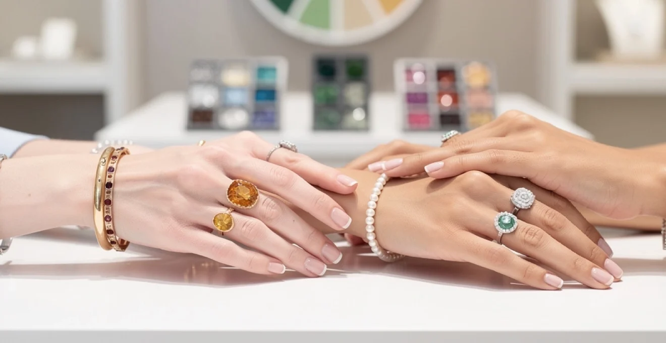
Metal selection science for optimal skin tone enhancement
Once your undertone has been professionally assessed, the next step is understanding how different metals interact with that underlying pigmentation. The choice between sterling silver, yellow gold, rose gold, platinum or palladium is not simply aesthetic; each metal reflects light differently, subtly tinting the skin around it. In colour science terms, metals act as “reflective filters”, bouncing specific wavelengths back onto the complexion.
When jewellery metals are chosen with undertones in mind, they can visually correct minor concerns such as dullness or sallowness and enhance desirable features like radiance or contrast. This is why, for example, two people wearing an identical white gold engagement ring can create dramatically different impressions. By treating metal selection as part of a broader personal colour analysis, you create a jewellery wardrobe that consistently flatters you, regardless of trends.
Sterling silver and white gold compatibility with cool undertones
For cool undertones, sterling silver and white gold are usually the most harmonious metal choices. Their inherently cool, bluish cast aligns with the blue and pink pigments beneath the skin, creating a unified, “tone‑on‑tone” effect. This alignment prevents the metal from looking too stark or brassy against the complexion, instead producing a refined, luminous finish that appears almost seamless on the body.
From a technical standpoint, white metals reduce the risk of unwanted colour reflection on cool skin, such as the yellowing effect that strong yellow gold can create. If you notice that silver jewellery makes your eyes appear brighter or enhances the natural rosiness in your cheeks without exaggerating redness, this is a strong indicator that cool metals are working with your undertone. White gold, particularly in high‑quality rhodium finishes, offers similar benefits with added durability for fine jewellery like engagement rings and wedding bands.
Yellow gold and rose gold synergy with warm undertones
Warm undertones tend to achieve their most flattering results with yellow gold and richer shades of rose gold. The warm, radiant wavelengths reflected by these metals echo the golden and peach tones present within the skin, creating an effect similar to applying a subtle, flattering filter. Rather than sitting on top of the skin, yellow and rose gold appear to blend into it, enhancing natural warmth and giving the illusion of a healthier, sun‑kissed glow.
Rose gold is particularly interesting from a colour science perspective because its copper content introduces pinkish notes that can enliven warm complexions. For clients whose skin leans very yellow, rose gold can add a touch of balance in the same way that a professional makeup artist might choose a rosy blush to counteract sallowness. When you try on yellow or rose gold and notice that your complexion looks smoother, more even and more luminous, you are seeing this synergy in action.
Platinum and palladium performance across neutral complexions
Platinum and palladium are premium cool‑toned metals that perform especially well on neutral undertones, though they can also flatter many cool and olive complexions. Their bright, almost mirror‑like reflectivity creates crisp contrast without overwhelming the skin, making them ideal for showcasing high‑grade diamonds and coloured gemstones. Because neutral undertones can accept both warm and cool inputs, platinum and palladium often look sophisticated rather than severe.
For clients seeking a modern, understated aesthetic, these metals offer excellent long‑term performance. Platinum, for instance, is denser and more durable than gold, making it a preferred choice for settings that must securely hold stones over decades of wear. If you notice that both yellow and white metals seem to work on your skin but you prefer a clean, contemporary look, platinum or palladium may represent the most versatile foundation for your core jewellery pieces.
Mixed metal jewellery coordination for complex undertones
Many people do not fit neatly into a single undertone category, particularly those with olive or highly neutral complexions. In these cases, mixed metal jewellery can be an elegant solution, allowing you to balance colour temperatures in a way that feels tailored rather than compromising. Combining yellow gold with white gold, or silver with rose gold accents, creates visual layering that can harmonise with subtle shifts in your skin tone throughout the year.
From a styling perspective, mixed metal designs also offer practical advantages. They coordinate easily with both existing warm and cool pieces, reducing the need to choose a single metal “forever”. If you are unsure where to start, consider a bracelet or necklace that alternates small sections of yellow and white metal; observe in natural light whether one section seems to blend more with your skin whilst the other creates contrast. This observational approach mirrors what professional colour analysts do with fabric drapes, translated into metal form.
Gemstone colour psychology and skin tone harmonisation
Whilst metal sets the overall temperature of a piece, gemstones introduce targeted colour that can dramatically alter how jewellery interacts with your complexion. Gemstone colour psychology explores how different hues influence perception – not only of mood and emotion, but of skin clarity, brightness and even facial structure. When chosen thoughtfully, gemstones can act almost like precision colour correctors, enhancing the natural beauty of your undertones.
In practice, this means considering both the hue (colour family), value (lightness or darkness) and chroma (intensity) of each stone in relation to your skin. Deep, saturated gemstones may bring vibrancy to deeper complexions, whilst pastel stones can look ethereal on very fair, cool skin. By aligning gemstone colour with your undertone and metal choice, you create cohesive pieces that feel intentional rather than accidental.
Sapphire and aquamarine selection for cool‑toned complexions
Sapphire and aquamarine sit firmly in the cool colour spectrum, making them natural allies for cool‑toned skin. Blue sapphires, with their rich, inky depths, echo the blue and violet pigments present in cool undertones, creating a sophisticated, almost regal harmony. When set in white gold or platinum, sapphires can amplify the clarity of fair, cool complexions and provide striking contrast against deeper cool skin tones without appearing harsh.
Aquamarine, by contrast, offers a lighter, more transparent take on cool blue. Its soft, sea‑glass hue can appear almost luminous against porcelain skin, whilst adding a refreshing highlight on medium and deeper cool complexions. If you find that stronger jewel tones occasionally dominate your features, aquamarine’s gentler presence may be preferable. In both cases, the key is alignment: cool gemstones paired with cool metals and cool undertones create a consistent visual language that feels effortlessly polished.
Citrine and garnet enhancement for warm‑toned skin
Citrine and garnet are excellent examples of warm gemstones that flatter golden and peach‑based complexions. Citrine’s sunny yellow to honey‑amber tones mirror the warmth in the skin, often making the wearer appear brighter and more energised. Set in yellow or rich rose gold, citrine jewellery can function almost like a built‑in highlighter, drawing light to the face and décolletage.
Garnet, ranging from deep wine to warm brick red, offers a more dramatic but equally flattering option. Its red‑brown undertones sit comfortably within the warm spectrum, creating depth without clashing. On deeper warm skin tones, garnet can appear particularly luxurious, especially when paired with textured gold settings. If you are building a capsule jewellery collection to suit warm undertones, one citrine piece and one garnet piece will provide versatile options for both day and evening wear.
Diamond and pearl versatility across all undertones
Diamonds and pearls occupy a uniquely adaptable position in jewellery colour analysis because they are effectively neutral. High‑quality diamonds primarily reflect surrounding light and metal, meaning they take on the temperature of their setting. A colourless diamond in a platinum mount will read cool and icy, whilst the same stone in a yellow gold band will appear warmer and slightly softer against the skin.
Pearls, though often perceived as simple white, actually come in a range of overtones from pink to silver to golden. This makes them invaluable for fine‑tuning harmony with specific undertones. Cool complexions typically suit pearls with rose or silver overtones, whereas warm and olive skins glow in the presence of cream or golden pearls. Because both diamonds and pearls can be adapted through metal choice, they are ideal centrepieces for engagement jewellery and heirloom pieces intended to transcend seasonal trends.
Emerald and peridot optimisation for olive skin tones
Emerald and peridot are especially effective for complementing olive undertones, which contain a subtle green base that few other stones address directly. Emerald’s deep, blue‑green hue creates a sophisticated echo of the skin’s natural pigmentation without blending in completely. Against olive complexions, emeralds can make the skin appear clearer and more even, rather than accentuating any underlying sallowness.
Peridot, a lighter, more yellow‑green stone, offers a fresher alternative that can look particularly striking in summer lighting. When set in yellow or light rose gold, peridot picks up the warmth in olive skin whilst still referencing its green base, creating a layered, almost “multi‑dimensional” effect. If you have olive undertones and have found that both very warm and very cool stones can feel unbalanced, experimenting with emerald and peridot is a practical way to experience gemstone‑skin harmony firsthand.
Professional colour wheel applications in jewellery selection
The professional colour wheel is an indispensable tool for stylists and colour analysts when refining jewellery choices. By mapping gemstone hues and metal tones onto the wheel, experts can predict how they will interact with different skin tones using established principles such as complementary, analogous and triadic harmony. This approach turns what might feel like guesswork into a structured, repeatable process.
For instance, a cool‑toned client with blue eyes might be advised to wear analogous colours – sapphires, tanzanites and amethysts – that sit adjacent on the wheel, creating a soft, cohesive look. A warm‑toned client seeking impact could instead explore complementary schemes, pairing blue‑green stones with golden metals to create vibrant contrast. By thinking in terms of the colour wheel, you can move beyond “does this suit me?” to “what specific visual effect do I want to create today?”
Seasonal colour analysis integration with jewellery choices
Seasonal colour analysis takes undertone classification a step further by grouping individuals into seasonal palettes – typically Spring, Summer, Autumn and Winter – based on undertone, depth and clarity. Each season has an associated set of colours that harmonise particularly well with its characteristics, and jewellery can be chosen to support these palettes just as clothing can. This method is widely used in professional image consultancy to create cohesive wardrobes from head to toe.
For example, Spring and Autumn types usually have warm undertones but differ in depth and intensity; Springs suit lighter, clearer golds and bright, warm stones, whilst Autumns shine in antique gold finishes and deeper gems like garnet or smoky quartz. Summer and Winter types, both cool, diverge in a similar way: Summers often prefer softer white metals and delicate stones such as aquamarine or morganite, whilst Winters can carry off high‑contrast combinations like platinum with onyx or vivid sapphire. Aligning your core jewellery pieces with your seasonal palette ensures that everything from your earrings to your evening dress works together effortlessly.
Advanced styling techniques for multi‑tonal jewellery collections
As your collection grows, you may find yourself owning pieces suited to different undertones or seasonal palettes – perhaps inherited heirlooms, gifts, or items purchased before you understood colour analysis. Rather than discarding these, advanced styling techniques allow you to integrate multi‑tonal jewellery in ways that still flatter your complexion. The key is strategic placement and balance, much like composing a well‑designed interior.
One effective strategy is to reserve your most undertone‑perfect metals for pieces closest to your face – earrings, necklaces and brooches – where they have the strongest visual impact on your skin. Rings and bracelets, which sit further from the face, can tolerate more experimentation with mixed metals or less optimal tones without disrupting overall harmony. You might, for instance, pair a cool‑toned silver bracelet with a warm‑toned gold necklace, knowing that the necklace does most of the “colour work” for your complexion.
Layering is another powerful tool for reconciling diverse pieces. If you own a pendant that is particularly meaningful but not in your ideal metal, wearing it on a chain that suits your undertone can mitigate the effect, much like adding a coordinating blazer over a less‑flattering top. Similarly, stacking rings of different metals on a single finger can create a deliberate, curated look that shifts focus from any one tone to the overall design. By applying these advanced techniques, you transform a mixed jewellery box into a cohesive, high‑performing collection that consistently complements your skin tone.